
In the advertisement industry, as well as any other industry that involves marketing, it’s likely that you’ve been cautious and pensive about how to present your content…and rightfully so. Aesthetics play a huge role in grabbing a client/user’s attention, and certain colors and fonts, as well as other aspects of presentation determine whether or not a client is truly interested in what your company has to offer.
Color: Why Does It Matter?
One of the most controversial, but fascinating components of marketing is the psychology of color, all because a majority of what is thought about this component is simply a hunch. However, slowly but surely, more and more empirical research is emerging, proving some of these theories to be correct.
In order to properly address this phenomenon in human behavior, I’m going to go over just what theories and thoughts regarding color, as well as fonts are valid and worth considering for your next campaign or project.
Most of how we perceive color as humans depends entirely on experience, as well as culture. This is why it’s too bold of a statement to say that perception of color can be applied universally.
How Do We Perceive Color
However, that’s not to say that the impact of color is insignificant, quite the contrary. In a study called Impact of Color in Marketing, researchers discovered that up to 90% of snap judgments made about products can be solely based on color.
While this concept depends on the product, it’s safe to say that we’re capable of judging something visually rather quickly, and that color is the main factor in our judgment. For example, if you wanted consumers to experience a sense of trust, reliability, and relaxation in your product, blue is a great color to use to ensure that you’re presenting your product in that way.
A brand’s personality in conjunction with the color it’s being presented with, is something that can make or break the success of an emerging brand (at least in regards to the way it’s perceived).
- Exciting Red and Competent Blue confirmed that purchasing intent is highly influenced by colors, due to the effect that its has on how the company is perceived by consumers.
An example of this being applied to presentation would be using pink and glitter to present barbie in the right light, as opposed to something dark and rugged.
The Isolation Effect
This concept in psychology is another way in which color has an effect on your campaign. In marketing, it pertains to how much you stand out next to your competitors. The isolation effect concludes that an item that “sticks out like a sore thumb” is far more likely to be remembered.
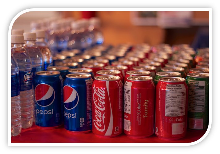
Let’s say that you run well-known software company, and the leading brands use a lot of purple and blue in their logo and campaigns. The surest way to stand out in any given market is to use colors that no one else uses, in order to make your brand more recognizable.
Coca Cola is a great example in that it uses red in its logo, whereas its competitors tend to use darker colors, like blue.
Sincere, Exciting, Glamorous, Oh My!
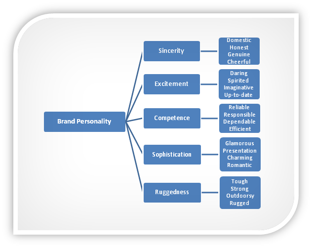
It’s important to note that while most brands are dominated by one trait, it’s entirely possible for others to cross between two, i.e. glamorous and daring. The Vancouver- based workout clothing brand, Lululemon, prides itself on being both efficient and reliable, as well as sophisticated and stylish. A psychologist at Stanford University conducted a study on this matter, and found five core dimensions that play significant roles in a brand’s personality:
A Color By Any Other Name
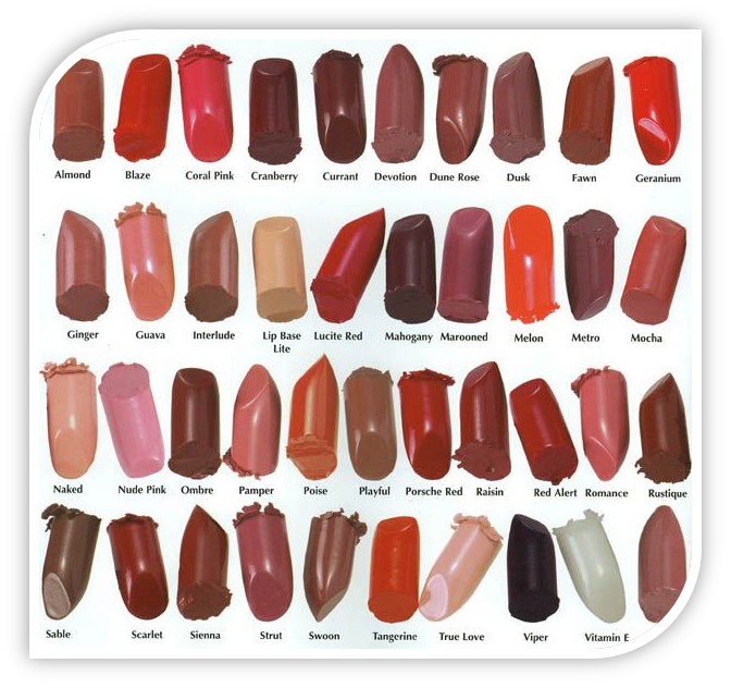
Another study was done to prove how crucial colors can be, but in the context of the names of color. The researchers who partook in it, discovered that when subjects were asked to evaluate products with varying color names (like in makeup).
Not only does seeing color impact your consumers’ perception and decision-making, but also the names you choose to call certain colors make all the difference. I love the way fashion designers call brown ‘mocha’ or ‘maroon’. Sounds sexy right?
In short:
- “Fancier” names were much more preferred than simple and generic names, like mocha, instead of brown, regardless of the fact that the researchers presented the subjects with the exact same color!
- Not surprising, because even I don’t like the sound of “brown” next to “mocha!”
- Choosing creative and descriptive color names can ensure that you present the color in the most optimal way, serving your best interest, and really grabbing your consumers’ attention.
Try These!
Fortunately, there are some very helpful tools available to play with color schemes, and to keep your schemes organized and easily accessed:
- Adobe Color CC– enables you to create and save color schemes that can be used later in photoshop, illustrator, etc.
- Design Seeds– see similar colors to whatever photo you hold up to the program, and find each color’s HEX code just by hovering over the screen.
- COLOURlovers– similar to design seeds, but a creative community instead, enables you to share your own color schemes and browse through those of others.
Font: Does It Really Matter?
Choosing the proper font for a project or campaign is also a crucial facet of optimizing your marketing strategy. These are crucial details not to miss if you want to to avoid scaring away your readers (We actually wrote a post about there here).
What I suggest, is not to go to any extremes, and really consider your audience while making a decision on which font to use.
Size Matters
- Don’t make the font too big or too small. If you make the font too small, some of your readers won’t be able to see it properly, and will therefore skip over your piece. If you make the font too big, it will look incredibly awkward, and user might also skip over the information, costing you traffic and potential customers.
- Try to limit sizes to 2-3 through entire piece/website. As a guideline, sizes between 16 and 24 are good for older audiences, but with younger audiences, you can get away with using something a bit smaller. Don’t get crazy!
Common Sense
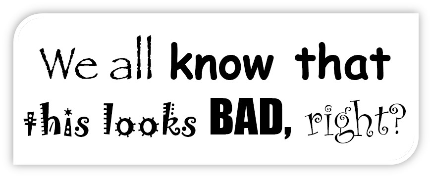
Have you ever noticed that expensive restaurants use difficult-to-read fonts on their menus? This is a tactic used to show how difficult it is to make, causing you to feel as though they are selling you an intricate craft, as opposed to “just dinner.”
In terms of which type of font to use, that’s completely up to you. However, I would suggest using something that is legible, because there are many fonts that are challenging to read. If the text will be on the web, it’s best to use Times New Roman, Arial, Verdana, or Helvetica. If you don’t use these fonts, then you may get a different result, causing your users to look away.
No surprise here, there is a correlation between our emotions and printed words. Designer, Sarah Hyndman, explains more in her recent TEDx talk about how the fonts you choose trigger a sensory response in your readers.
When in doubt,

Be Consistent
Consistency in font translates to consistency in your product/services. it shows reliability, so don’t use more than two or three different fonts per piece, otherwise it looks vague, unprofessional, and awkward.
Don’t know which font to use? Here are some tools that can help you decide:
- Font Squirrel– source of various fonts available for download, free and licensed for commercial work.
- Typetester– helps you customize available fonts, as well as preview/compare them in a paragraph of text below
- Typcast– This browser-based web fonts app allows you to experiment with more than 23,000 web fonts from Facebook, font.com, and Google Fonts, even if you don’t have an account with any of those platforms.
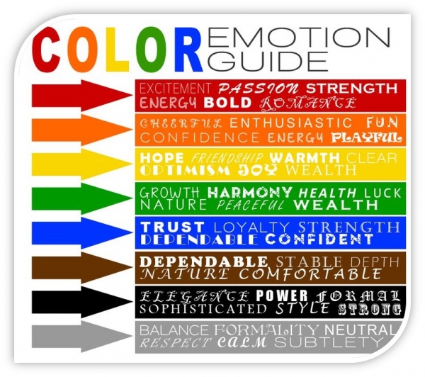
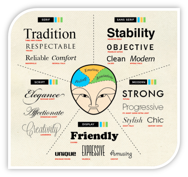
Here is a nice guide to help you out:
Just Remember
When it comes to colors and fonts, there is no one-size-fits-all approach. Every situation and project will be different, and will require different tools, mindsets, and styles. Before committing to a particular font or color, see how others feel about it. In addition to showing your coworkers, I recommend showing your family and friends your ideas, and asking for their two cents. While you should definitely be mindful of colors and fonts, remember that you only have so much control over results, so do A/B testing to have a good idea as to how your audience is perceiving the presentation and distribution of your content.
So, now that you know just how influential colors and fonts are in marketing, just think about how your own decision-making mechanisms are affected. What comes to mind?