All of us have certain expectations when we are browsing the internet for content, and often this is paired with specific preferences. If I’m looking for a contact page I know I can generally find it by scrolling to the bottom; or if I click on a link the color it will change to let me know I have gone there already. These fine details make up the user experience and when it’s done right it can highly increase the likelihood of me returning to the website or even subscribing.
In the publishing world, sites are constantly striving to be the best and most user friendly. This isn’t always easy as the user experience landscape changes so rapidly, which is mainly due to its dynamic nature. From the text you use, to the visual takeover, and specific user interactions, it is even more important to be aware of the finer details to watch out for when optimizing your site.
The Text
Never use fancy or unreadable fonts; when I’m looking for content I don’t want to struggle to read the writing. Though it might look pretty, practically it won’t work in getting people to continue reading. I personally like the long time favorites Sans Serif or Serif fonts – they are favorites because they work. Blinking text is a big no in any scenario.
Your font size and spacing matters; It may sound finicky but spacing makes a difference. You want to make the experience comfortable for your readers so that they absorb the message you want to give. Spacing out your letters and lines will add a subconscious credibility to your content as well as make the content easier to read. This is a great example of optimized spacing and size.
The Images
Visuals are key in breaking up heavy text pages; As a reader, my attention span is limited to a number of seconds so using pictures in the right format can increase the amount of time I spend viewing your page. Not only that, images create a flow within heavy text pages that can aid your readers through the content to the end. You can make images stand out by putting space around them and using people focused, clean photography that de-clutters the visual expression.
Use ads that compliment your images; Being part of the advertising industry I recommend you to use imonomy to optimize your advertising space and de-clutter the ‘noise’ on your website through in-image ads. This de-clutter helps maintain the reader’s attention whilst improving your advertising space. See how this works.
The User Interactions
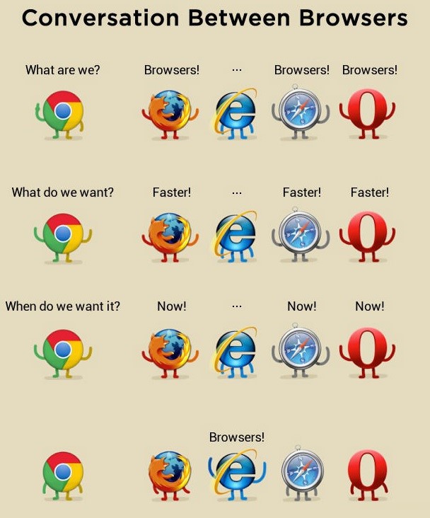
Remember that people still use Explorer; OK I don’t use explorer anymore, however there are people that do. Making your website cross browser compatible is crucial in retaining readers in the long term.
Content on all devices; Currently I have 3 different devices I access content on, so responsive web design is crucial. Make sure you have a responsive web design that can adapt itself to varying device resolution. There is more to the dynamic of screen resolution than you think.
Color changing links; this might sound basic, but having links that change color when you’ve clicked on them helps navigate the content much more efficiently and not duplicate any reading you’ve done previously. This saves time and increases the flow of reading, raising the standards of content sites.
The Bits on the Side
No music allowed; try to avoid playing music on your site at all costs, its cheesy and off-putting. Using videos and other audios (podcasts/webinars) are great at giving a new element to your content, however you must allow the user to control when they want to play it, pause it, or switch it off.
Make it easy to connect; one of the worst things for a reader is not being able to connect. When you have your contact details easily accessible it gives your audience a chance to contact you and potentially give you a new lead or crucial feedback. Positioning your contact button at the top of your page is portraying your open and friendly manner.
The Extra Mile
These fine details make a huge difference to me (and I’m sure to others) when looking for content online. The best publishers follow these simple methods in order to optimize their user experience and are rewarded for it with active readers, engagements and referrals. Though sticking to recommended methods, it doesn’t mean you shouldn’t think outside of the box. Often when websites surprise me with well thought out additions, I am much more likely to engage with the site.
What have been the best additions that have an out of the box style approach that works?


0 Comments