
Have you ever asked yourself “why does my site not create the conversions I need?”
If yes, then you are not alone.
Conversions can be measured in several ways. As a publisher your main target is usually to convert readers to subscribers. For publishers like the Washington Post, this is even more crucial as they now charge their readers for accessing their content and conversion strategies are essential for success. Whereas an advertiser or ad network is likely to want to convince publishers to use their service. These might sound similar, but there are a few tactics that differ.
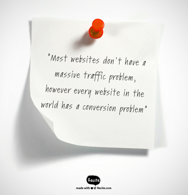
If you are interested in conversion, you should stick this quote by Bryan Eisenberg on your office fridge:
Throughout this article I’ll highlight which ones are specific to either audience (publisher/advertiser), otherwise you can assume that the strategies can be applied in general to any site.
What is Going Wrong?
Any conversion expert is going to tell you that for every site there are different issues that will affect your conversion success. These include:
- Your website design is not updated to match current trends. This can cause your users to be put off due to their own online experience expectations.
- You have not optimized your site for the mobile era. Remember Mobilegeddon?
- Your call to action is hidden in masses of content that none of your readers actually get to.
- You think that because you have a great product/content then readers will sign regardless of your conversion optimization.
There are many other reasons why conversions fail either as a publisher or advertiser, fortunately it is down to you to improve your site to create those leads you want.
Case Study 1: HOW A B2B COMPANY GOT 78% MORE CONVERSIONS
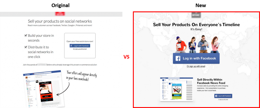
Goal
Increase sign ups and final application of product. You probably experienced (and understand the pain) of when people sign up but never complete the process of application.
Modifications made
- Wording; swapping the words ‘social networks’ to ‘everyone’s timeline’ in the title of the site helps first time visitors understand the message and purpose of your product straight away.
- Call to action; the largest button was placed above the fold and also continuously appeared throughout the homepage content as users scroll down to catch those that need that bit extra information.
- Step by step guide; visual content and information was added to explain the process and benefits of the product.
Results
- 35% increase in signups
- 78% increase in complete application of product
This is a great example from Conversioner of how a B2B company improved their conversions by changing the layout of their site. The image they used for the successful version is much more appealing to the eye with the use of people in action.
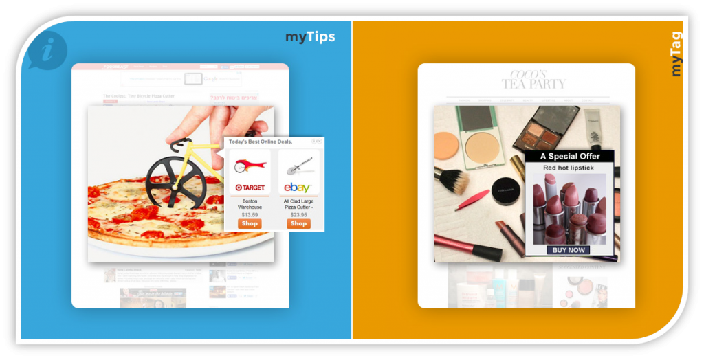
Images Are More Powerful Than You Think
Let’s face it. We are visual creatures, always have been and always will. Just the medium changes. When it comes to conversion, your images and UX design is one of the first things that will either attract or repel readers from your site. However, not all marketers are using the details behind powerful images to increase their leads.
Basically, it’s not good enough thinking; ‘This is a great picture so it’s bound to entice people to my site,’ you have to really understand how the image can work for your audience.
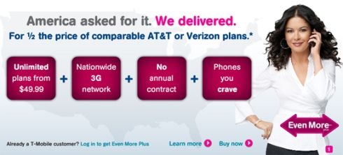
For example, using an attractive woman does not always work as well as you think. T-Mobile made this mistake when they employed Catherine Zeta Jones to promote their products on their homepage; readers were reported to raise their frustrations and say “She’s a very pretty woman,” the shopper told us, “I just wish I could see her buttons.”
Moral of the story? You have to consider your audience, the position, the background color and even the type of smile they have in order to optimize your conversion.
Mascots
Many online sites have their own mascots who portray their message to their readers in a more personal and unique way. Having a mascot can connect your readers with your site as a singular personalized entity, rather than a virtual online system wanting something from everyone. One of my favorite examples is from Moz. Their robot mascot has become a familiar face on its own, and is used for many branding and marketing strategies for the Moz team.
Stock Photos
Try and limit your use of stock images as a rule to getting more conversions. People are so used to seeing generic photos so that if you use them the power of the image is instantly lost. I understand if you can’t afford to apply this strategy as it is time consuming and sometimes not always practical. But in general you should try and refrain from using cheesy photos and aim for something that is out of the box. I mean, we all love teamwork but is this really adding any value?

A/B Testing
The only way to find out what images work is to test. A/B testing is the number one rule when it comes to conversions and it starts with images. And don’t stop just at your website, you should be testing your social media images, ad design and more. Just keep testing until you hit the sweet spot.
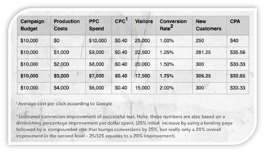
And if your boss tells you there is no money to invest in an optimized conversion strategy, just show them these figures (note: production cost refers to what you spend on conversions):
Context
Make sure your images are in context with your content. There is no point using a fantastic image that doesn’t mean anything to your audience or product. Not only is this important for the overall presentation of your website, its also important if you are monetizing your images using in-image ad technology (like ours).
The purpose of this strategy is to have related ads and content, with the image being the center of the process. If your image doesn’t match your content you will be missing the crucial ingredient to increasing your revenue. Want to find out more about in-image ads? Contact us here.
Emotions
We are well in to the technology age and yet marketers are still applying the same basic psychology strategies to get people to buy, convert or react in a certain way. Your image should elicit emotion and get your reader to the call to action you want. As I said earlier, smiling attractive women may not always work and its down to you to test what works for your audience.
Talia Wolf CEO of Conversioner puts it like this: “Behavioral testing tells you what visitors are doing but not WHY they’re doing it. Emotional Targeting helps you learn and scale your test results.”
Don’t Make it Easy For Your Audience. Huh?
This is one of my favorite hacks. We normally hear that the more you make the experience for your audience streamline and straightforward the more they are going to want to engage with your site. Right? Wrong.
In some cases it’s actually better to make certain processes a bit ‘less comfortable’ than what you think. If the Obama Administration is going with this tactic you might want to take note.
Take for example navigation bars, a regular feature on many sites.
Case Study 2: REMOVING NAVIGATION MENU INCREASES SIGNUPS BY 100%
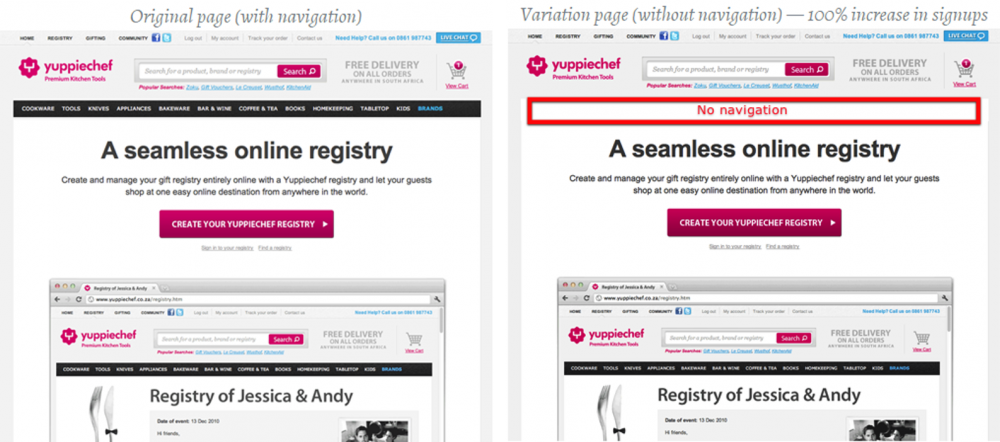
Goal
Increase sign ups from a specific section of their site. A basic conversion goal.
Modifications made
- Removal of navigation bar; this was the only change was made in the A/B test to clear up the landing page.
Results
- The site saw their conversions increase from 3% to 6%
As you can see when the page is cluttered with options you can distract the reader away from your target of getting them to sign up. In this example, the site saw a 100% increase of leads from this one simple change.
And remember, the removal of the navigation bar is something that makes movement on the site slightly hard for the reader, and though it might not your first instinct when it comes to conversions, this shows that it can work.
The Magic Words That Lead to Conversions
If you haven’t noticed, there is endless amounts of articles that discuss the important of language when it comes to conversions. There is even a psychology behind headlines. This is because language is one of the ways you can elicit emotion in your target audience (if you missed it, I wrote about emotions in the first half of the post).
One of my favorite influencers that writes a lot about this kind of stuff is Nir from NirandFar blog. He covers many business and marketing concepts and applies an element of behavioral psychology to it which is an essential part of conversion tactics.
Here are some words you should pay attention to:
- You – when you think about the purpose of conversion, it is basically to convince your target audience you have something to fulfill their needs. Whether it’s amazing content, or an Ebook they must read, by using the word ‘you’ around your call-to- action you are directly reinforcing that they have a need for something.
- Join – as an online publications you want people to sign up to your site. Asking people to join is a way to say we are a community, rather than a hard sell. We are social creatures and like to be part of a group. If you can make your target audience feel this, you are heading for success.
- Free – though this is considered to be one of the power words in conversions, it is not always the case. As this can come across as a cheap sales word, you should really deliberate if this is the right one for your specific conversion goals.
- Because – when you explain a reason for doing something you will find that people are more likely to engage because you already gave them a reason for doing so.
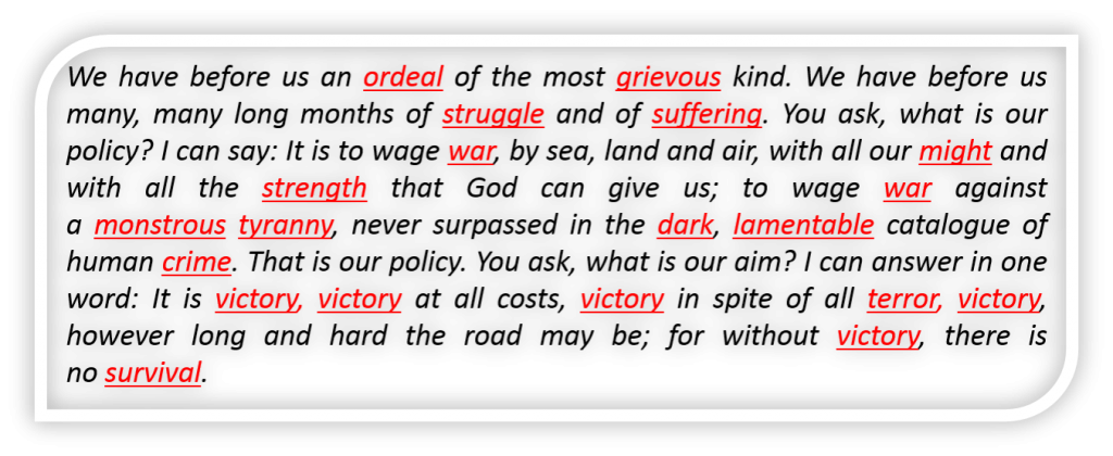
Jon Morrow from Boostblogtraffic put together this amazing list of 317 power words that is a good resource if you are struggling to come up with any.
I also love their example of Winston Churchill’s speech, see if you can avoid being inspired by it.
If you want to display an exclusivity to your site you should consider using these words:
- Login required
- Get news before everyone else
- Only available to…
- Invite only
- Exclusive offer
Negative Words
It’s not always the positive words that get most of the attention. Sometimes using words that are contradicting the context can work wonders for your conversion. For example, what would you be interested in more?

Take a guess which one TechCrunch used.
10 Not Ten
Everyone knows how numbers and statistics help increase interest and engagement from readers. In the last few years we have seen increasingly longer lists and this is because bigger numbers work better.
The important thing to note here regarding conversion is that you should always use the number 10 rather than writing ten. Why? It breaks the reader’s skim reading process and also makes your content more reliable.
Also when you use time units, I.e. you only have 2 more minutes to read this post, can also help you increase urgency for a call-to-action without having to push unnecessarily. This works especially well with limited offers that you want to emphasize.
Customer Testimonials (For Advertisers)
Adding a customer testimonial section to your site will help increase the trust new readers will have in your product. This isn’t new advice and if you haven’t listened to it before it might be time to try it out.
Even in 2007 MarketingSherpa’s research found that online users prefer sites with reviews.
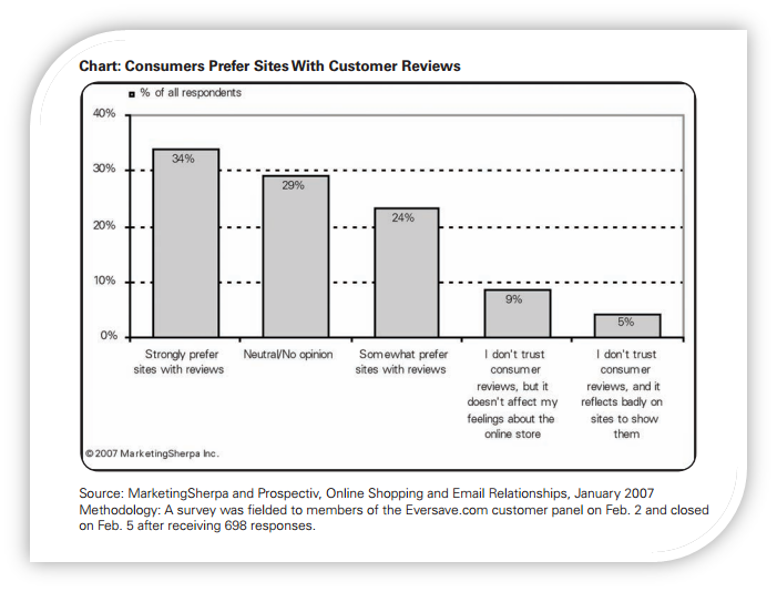
So what does this mean for advertisers?
As you are in the advertising industry you probably know that there is a huge amount of competition and to stand out from the crowd is not easy. A way to increase conversion to your service is to use current testimonials that show how a successful relationship between you and your clients.
The Importance of Mobile Conversion Optimization
So you’ve done everything to optimize your conversion rates on desktop. Think that’s enough? Think again. When 70% of the US mobile market use smart phones, your conversion tactics must translate to mobile devices.
Case Study 3: 6 x REVENUE INCREASE IN 1 MONTH
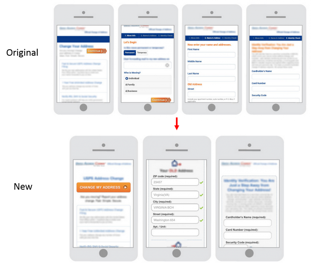
Goal
A million dollar mobile campaign was running for 2 years and only getting 0.79% conversions. The goals here were to get people to sign up AND pay for the service on their mobiles.
Modifications made
- Reducing information requirements; when people are signing up to your site through mobile they want to put as little information as possible or they just close the browser.
- Shorter process; the entire process was shortened from 5 to 3 pages, something that is crucial for mobile users as it is quicker and simpler to complete the form.
- Automatic fill in; by adding an automatic fill in process for the address (by in putting only effort) it reduces the amount of effort for users.
Results
- The conversion rate increase to 4.65% from 0.79%. This produced 6 x more revenue for the company.
In short, every site is different and it is not enough to have a responsive desktop version and think that this is optimized for mobile conversions. Pages that have been designed with the mobile user in mind are generally going to see better results. This means that you also have to consider pages for bigger devices such as iPads and other readers in relation to the audience that uses it the most.
I would suggest creating multiple landing pages for best results, Hubspot found that businesses with 40 + landing pages created 12x more leads than those with 1-5 variations.
Conclusion
Conversion is all about approach. You cannot apply just one strategy and hope for the best. Using powerful images and words will only work if you put them in the right context and location on your site. For more inspiration you should check out Kissmetrics mammoth 100 case study post, I was impressed!
In essence I believe that the best changes happen when you do something drastic. Taking care of the fine details is important, but if you can make an informed radical change it might be the best thing you do this year. This doesn’t mean you have to overturn your whole image, but by making a significant change you can make enough of an impact on your readers to move your bottom line.
So did I convert you? Join us for free content every week to help you push your business forward! Leave me your email and I promise to send a personal hello.