
Now, I know what most of you publishers are thinking: “Why would I ever use those annoying pop ups on my website? What a way to drive users away!” And while there is a lot of validity in that thought, there is also quite a bit you should know about the use of pop ups on your website to maximize the potential of your online presence.
Why Pop Ups Should Be Used
Lately, several individuals have found that when they effectively use pop ups has helped their conversion rate increase. For example, Nikki McGonigal, a full-time blogger and crafter on Etsy, used an opt-in pop up on her website. The result? The pop up drove conversion up a whopping 1,375%!
![nikki-optin-lightbox[1]](http://blog.imonomy.com/wp-content/uploads/2015/10/nikki-optin-lightbox1.png)
You probably aren’t a big fan of them, but the fact of the matter is that they work. Even as a publisher, you can benefit equally from the use of pop ups, as much as any blogger. Pop ups can potentially be a chunk of the reason that your company is raking in money via lead generation, and they have the ability to reel people in. So, given that you used pop ups effectively and correctly, there is no reason for you to have dramatically poor results by using pop ups. The truth of the matter is that pop ups have the ability to radically accelerate how many opt-ins you get on your email list.
How To Use Pop Ups
In eseence, pop ups work by notifying your users of a message in the most direct way possible. For pop-ups that aren’t annoying, or at least not as annoying as they could be, you need to find out who you’re talking to, and then think about how to make your offer as personalized as possible. Personalization online is a complex endeavor, but don’t worry! There are some sophisticated solutions available to reclaim the power of influencing everyone who visits your website.
A pop up is a ways that information from your users can be gathered when it appears. This isn’t to be confused with pop up ads, which are simply ads in the form of a pop up. Pop ups for the sake of conversion, rather are tools that can be used in order to successfully engage your user.
In particular, what you want to shoot for are sign up forms.
Additionally, one of the perks of using pop ups, is that you have the option of setting a cap on how many times it appears per user. This ensures that you don’t annoy your users, so that each time someone visits, they’ll only see the pop up once.
The advantage of this technique is also that you can filter through which leads are the most serious. This is because if someone is interested in your product without 10 pop ups appearing every time he clicks, it’s likely that he won’t be overwhelmed by popups, therefore feeling more comfortable leaving his details.
The Different Kinds of Pop Ups and How To Use Them:
Timed
Timed Pop-Ups work by appearing on a landing page or website after the visitor has been on the site for a certain amount of time. Here are two main things to consider:
- Some providers give you the option to set it only at a few increments (i.e. 10 seconds and 30 seconds). Others, though, such as Wishpond, allow you to run tests in order to most effectively determine the increment that works best for you. Therefore, their increments aren’t so exact, so if 23 seconds is what would help you most, then by all means, do that. For example, Marketing Land uses this timed pop up just seconds into entering their website.
![01-5-examples-entry-website-popups_2[1]](http://blog.imonomy.com/wp-content/uploads/2015/10/01-5-examples-entry-website-popups_21-e1445854476371.jpg)
- I’m personally not a fan of timed pop ups, but I know that plenty of publishers find them to be useful. If you are keen on giving them a try, I would highly suggest testing as carefully as possible. As a rule of thumb, try not to go below 30 seconds on blogs, nor should you go above 60 seconds on product pages or company websites.
Scroll
I like scroll popups, but only in certain contexts, because otherwise, you might drive your audience away, and that wouldn’t be good! As a publisher, I can imagine that knowing that your potential traffic is invested enough in your content is the first step, before even considering trying to implement a conversion strategy. Hence why I prefer the use of pop ups on blogs versus other mediums of presentation. So, in order to use them efficiently, remember these two things:
- Scroll pop ups are a wonderful tool in that they ensure that the user is already engaged in the content.
While this is no exact science (far from it, actually), what I choose to do with my blogs is adjust it so that once the user is 65% +/- of the way in on a page, the pop up appears.
- By using this number, or something close to it, I have a better chance of addressing an audience that is more interested in my content.
This pop up appears on imonomy‘s blog page, after scrolling about 2/3 of the way down the page:
Entry
Entry pop-ups can potentially be dangerous. As such, they are among the most underrated pop-ups techniques available so far. As soon as a website is finished loading, they appear. They work by basically blocking a visitor from seeing the page they wanted to see until they’ve engaged with it.
This means that entry pop-ups appear before anybody has had access to your page’s image, which is a bit questionable to some. However, they can be super helpful if you consider my following suggestions:
- Run an online contest or promotion, but don’t advertise it too much.
- Direct your traffic to your price page, as you would normally without the promotion.
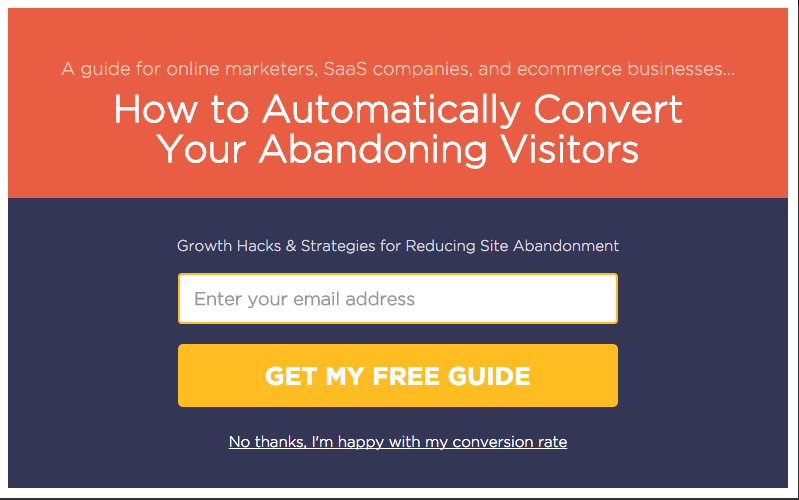
- Set up an entry pop up on the price page. Or, if the offer is free, lead them to a sign up page to sign up to your service. For example, on getrooster, the user will see this pop up first:
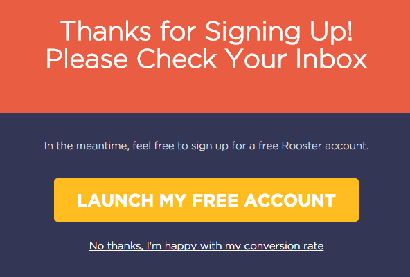
Then, after entering his email, this box will appear:
- Use urgent language to entice the user to take advantage of your offer, therefore engaging further with your website, i.e. “Hurry! Limited time offer: get (your product) for a fraction of the price for only $XXX!
Exit
An exit popup is a message that appears to users once they attempt to navigate away from your website. The most common motivator for an exit pop up is to show the user a message telling why users shouldn’t leave the site.
An example of an exit pop up is once a user decides to leave, this pop-up will show a form of media that appears on the top of the original page. Often this contains some sort of offer embedded somehow in the following:
- a link
- a video
- some kind of design
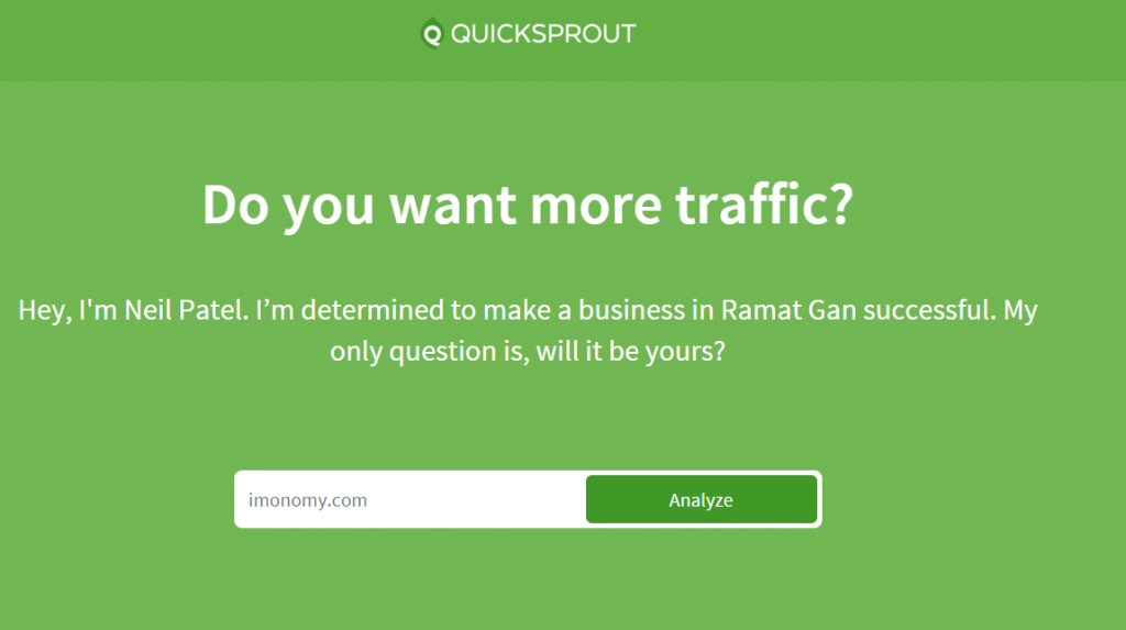
I’m a big fan of how Quicksprout goes about their pop up, because not only do they limit the amount of pop ups per user, but they also invite you to leave your information in a friendly way:
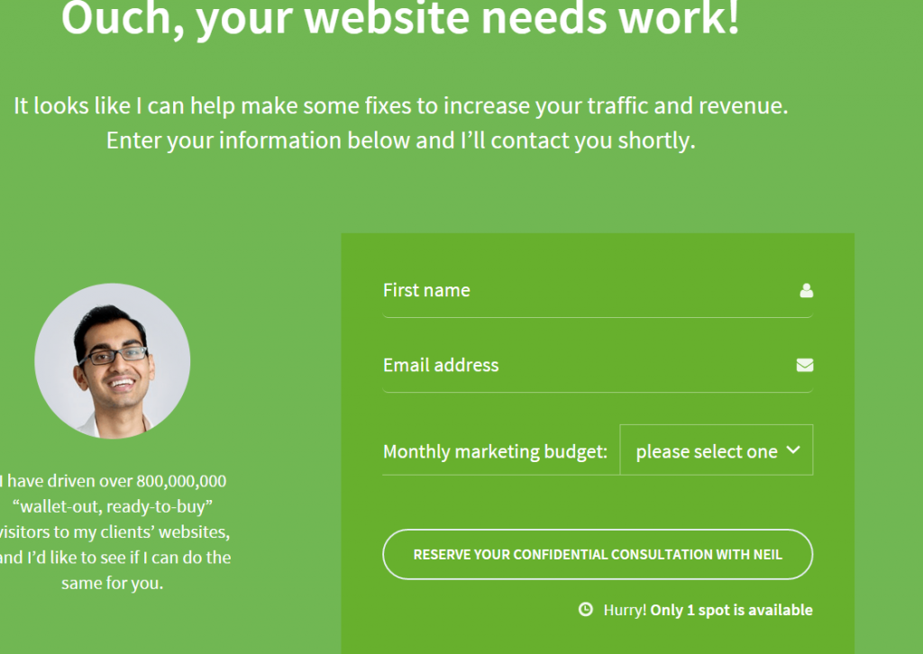
This is kind of pop up provides a good opportunity to ask for the user’s details, making conversion much more likely. However, with the asking of details, you need to be careful. I have found that if you ask for too many details, i.e.
- phone number
- company
- name
- city
as opposed to just an email address, you could jeopardize your goal of converting your users.
There are several different techniques that can be used for maximizing your exposure with pop ups, but this is by no means all of what the area of pop ups consists of. The ones I mentioned are among the most common, but because pop ups are a phenomenon in the world of publishing that are most useful when tested, there is no “one size fits all” approach when applying different pop up settings. Try a couple of kinds that intrigue you, and see what works best for your product or service.
Lastly, don’t forget to take time in paying attention to details such as color!
Have you ever tried using pop ups on your website? If so, how did it go? If not, what are you most eager to try?