No matter the device, we all want our websites to have sugar, spice, and everything nice.
But what does that mean in marketing terms?
Well let’s start off with one thing. Our websites need to be engaging.
But more than just engaging, we want our users (both old and new) and even our brand loyalists to be truly engaged in their browsing experience while exploring around our page. They may be swiping around, touching buttons, clicking, scrolling, you name it. We need to be ready for all motions, and our content needs to be ready, too.
What we’re most concerned about is how we’re interacting with their eye movements around our page. When they’re on our site, we need to bring them to their (and our) happy place.
For example, every reader has a personal favorite color (or several), a preferred interface, a type of button he is more inclined to click on, etc. So how can we know what will meet any random user’s visual fancy? And how can top online publishers tailor their sites to millions of individuals who continuously browse through their content?
Short answer: We need to approximate with successful trends, align them up with our content and branding style, and learn to trust our artistic instincts.
Now here is the long one.
The ‘F’ Factor
The ABCs of visually pleasing websites actually begin with the letter ‘F’. I guess you could say part of using your artistic instinct means being flexible, in many ways.
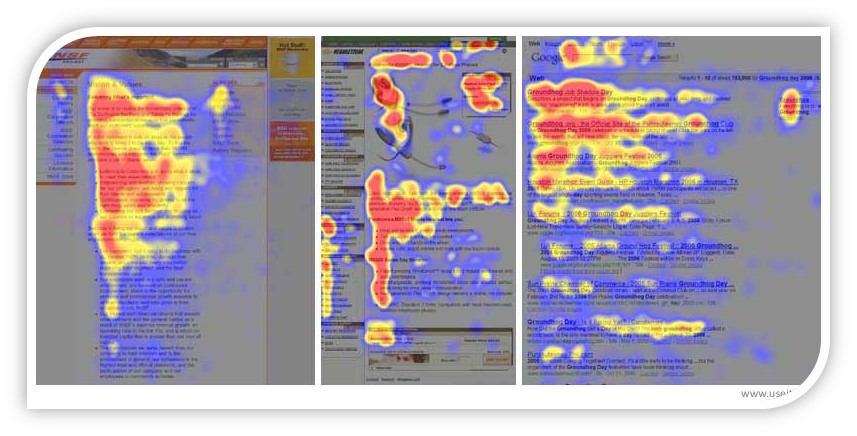
As readers, we start with F. Back in 2006, Jakob Nielsen tells us that users often read Web pages in an F-shaped pattern: two horizontal stripes followed by a vertical stripe.
This fun fact explains why most web pages share the fundamental structure of a thick header across the top of the page, and a column of menu tabs/options vertically down the side.
Taken from Brandon Jones’s piece on web design, the wireframe below draws out the pattern our eyes would follow according to the text positioning.
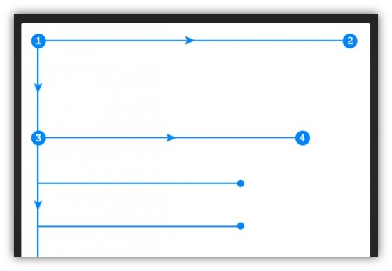
Did your eyes follow?
Feels pretty natural, right?
But…
this F factor has almost become an unwritten rule of thumb, and is the mere foundation for how we should map out our webpage design to catch the undivided attention of our customers.
We want to do more than just follow their eye movement, we want their eye movement to bring excitement, engagement, and an appeal to keep scrolling downward.
That being said, TNW points out two well-known publishers are great role models for milking the F factor for all its worth — I assume you’ve heard of The New Yorker (Conde Nast)?
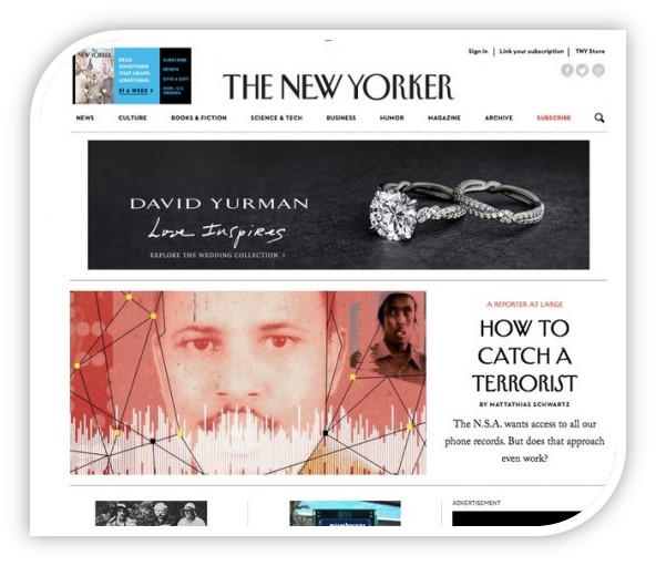
By placing two large images beneath their emphasized header, the New Yorker ensures that it’s logo title is the first item to catch the reader’s eye. Standing out among the images, no reader is gonna forget which publication they’ve landed on.
The Wonders of Web Design
In the last year or so, certain web page layouts have become very popular and successful, chosen by UX pros to convey a certain ‘aura’, or vibe via their published content. Web page designs create these impacts by building wireframes that maximize key usability features, such as longform scrolling, or by choosing a certain interface theme, such as ‘material design’.
By looking at some prized examples, you will be able to make the comparisons and choose the right interface/image for the content you publish, enhancing your effect on readers.
Minimalist Navigation: Medium.com
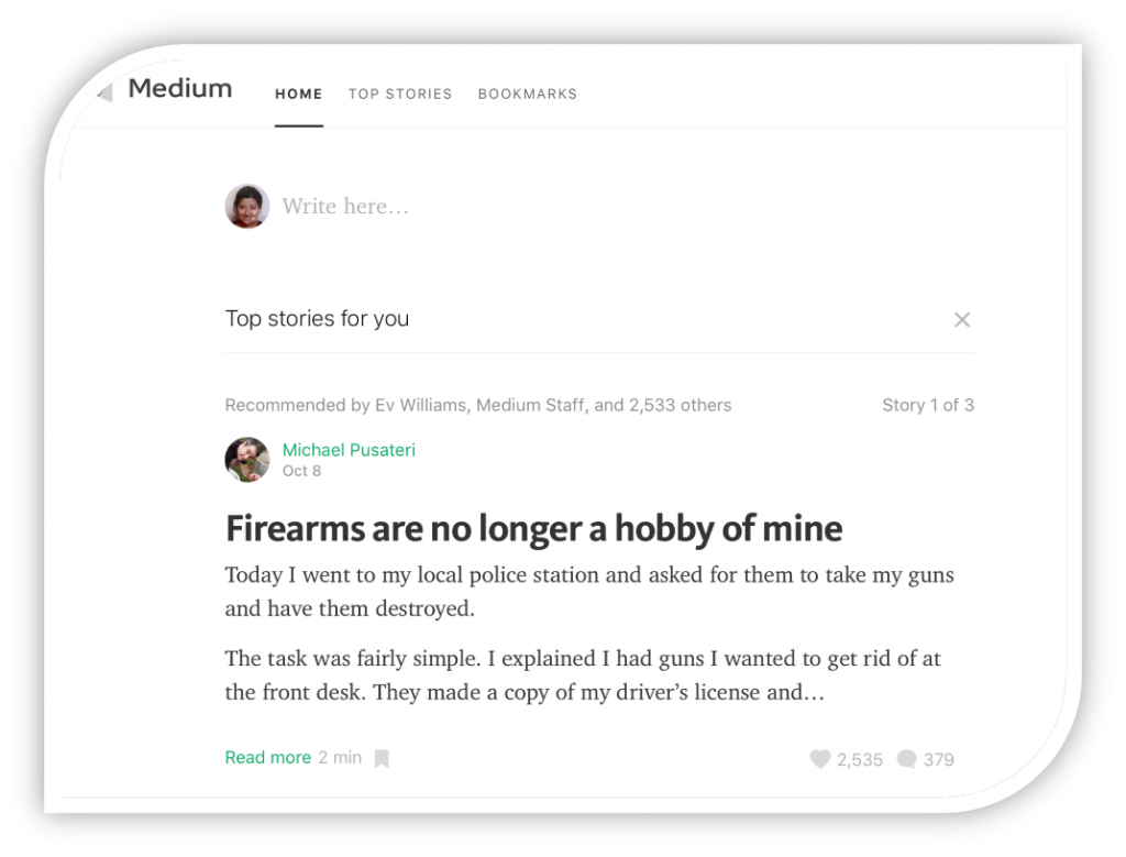
Minimalist navigation can also be known as ‘Content-focused design’. But the name really isn’t important, because as we already know, with content, it’s not the name or title that counts, it’s the effect…the end game.
In this case, ‘minimalist’ and ‘content-focused design’ can be synonymous — they share one agenda: no distractions, no chaos. The reader and your content are in a world of their own. The reader is focusing solely on his line of vision, and vice versa.
TNW (Jerry CAO) actually tells us what to look for in minimalist navigation, explaining the goal of each feature, and how it can drive your content in the direction you need it to.
Looks are deceiving, explains Jerry. When you see minimalist design on a web page, you probably think you’re seeing ‘the bare minimum’.
But really, what you’re seeing is “the same level of usability…with less interface”. That’s right, you’re called upon to be super resourceful — to achieve as much as you can, with as little as possible.
You need to get down to the nitty-gritty of the information you’re publishing. At first glance, it’s the only content that meets the eye. Everything else is white noise.
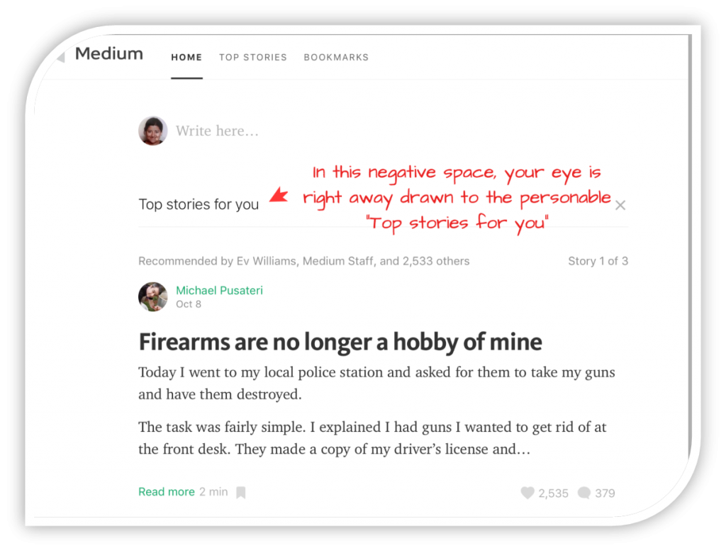
Negative Space
By surrounding your succinct text with loads of negative space, you’re actually drawing the user’s visual flow to your text as much as possible. You’re preventing them from getting overwhelmed by text, and you’re guiding them to what they need to read, as smoothly and freely as possible.
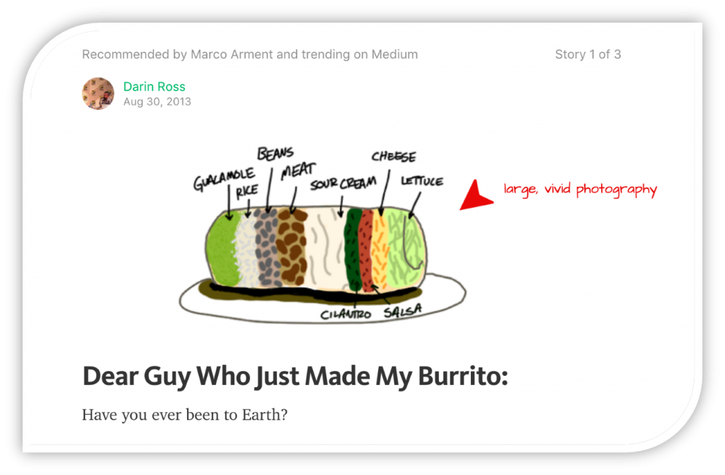
As you notice, Medium’s minimalist design also illustrates large and vivid photography, dramatic typography, beautiful contrast, stupidly simple navigation, and lastly, flat design.
Tip to take home:
When choosing a featured image for an article or synopsis, decide what the most important element of the image is, and make sure it’s visually emphasized more than any other element. This can mean cropping, changing the image contrast, or simply placing the image on a surrounding white backdrop.
Snowfall: BBC News & NYTimes
Have you heard of Snowfall design?
Creativebloq tells us that it’s “a new way of presenting longform journalism through art-directed web design.” But wait, it’s so much more than that. Snowfall design includes so many sleek n’ savvy features: parallax scrolling, web video, and longform/infinite scrolling.
Let’s break it down:
The NYTimes (shoutout NYC) introduced the Snow fall feature to online Journalism. In addition to its jaw-dropping beauty, Snow fall is actually referred to as ‘newspaper web design at its best’.
Showing the standard ‘words and pictures on a page ’ layout who’s boss, the Snow fall feature still maintains the print format, yet creates a multi-chapter series of content, integrating video, photos, and graphics.
Snow fall designs often open with a full-screen video on loop (not to be mistaken for a GIF).
The effect is 2-fold:
- The multimedia feels natural and serves a purpose, it’s not just a hodge podge of funky features spread out on a page.
- It sweeps us off our feet.
Before we continue to rave about Snow fall design features, check out some super-impressive examples from the Guardian.
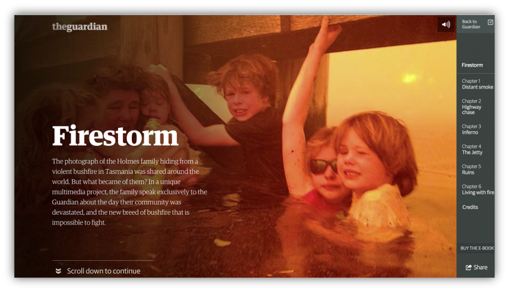
Some may describe this Snow fall design as a “bold leap into an experience-based feature”, others may point out that it’s also a long-form story online, as well as a Parallax element. But no matter who you ask, it’s a gorgeous storytelling approach that captivates anyone and everyone.
As a reader, while I read the minimal yet poignant descriptions of the Holmes family’s experience, I share their experience visually, as I’m captivated by the lifelike visuals.
When you’re publishing a vivid story for your reader base, choose a visual effect that makes the story come to life. And please, exaggerate all you can.
More and More Features
Within Snow Fall design storytelling, there can be so many more design tactics that are embodied in the overall design.
Modular Scrolling, Parallax scrolling, Longform…we could go on for a while.
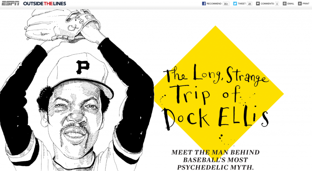
Modular Scrolling
On ESPN you can clearly see that as you scroll down, you glide through the text on the right side, yet the image on the left stays still. You’re scrolling through one column, rather than through the whole page. The continuity of the left column keeps you focused, and the vivid motion down the right column keeps you engagingly intrigued.
Modular scrolling at its finest, is a form of motion design with infinite scrolling, with fade-ins keeping viewers engaged, in a world of (seemingly) infinite content.
If I had to explain Parallax to my great aunt, how would I define it?
The Webydo blog actually does a good job:
Parallax = “any item on your canvas moves at a slower rate than the foreground elements, creating a 3D effect and a heightened interactive experience when scrolling.”
Parallax scrolling actually uses CSS to make different layers on the web page move at different rates. Instead of having all the text, photos, videos, and other elements move screen altogether when you scroll down, it feels more like a visual page turn, with a new layer of beautiful imagery or video or text gliding up to replace the just read “page.”
“It makes you feel, as a user, that you’re sort of interacting with the page” says Pitchfork’s creative director, Michael Renaud.
All of these examples we just listed are forms of ‘Longform scrolling’, or ‘Longform journalism’ as some like to call it.
It’s seamless storytelling, in the sense that the images, videos and text don’t feel as though they’ve been attached/binded manufacturally — they feel like one natural entity that the user is experiencing, so real that the joinings between medias isn’t even apparent.
When choosing how to weave an effective storyline into an ad, we often aim to show viewers a real-life scenario. Something they can tap into and identify with. The more naturally your imagery and texts jive together, the more real your message seeps into reality.
Mobile first, but not only
Whether it’s an outcome of mobilegeddon or not, the content and media industries know through and through that their web content needs to be super duper mobile friendly. Some might say it’s even more important than web content being 100% suitable for a computer screen.
When adapting to a mobile interface, we’d hate to forego all of our eye-catching graphic abilities. Thankfully, many of the latest and greatest web design layouts are especially conducive to mobile and on-the-go viewing.
MicroUX Design — the details look and feel simple, yet lift you off your feet
The Daily Beast uses a clear example of MicroUX in their reading experience.
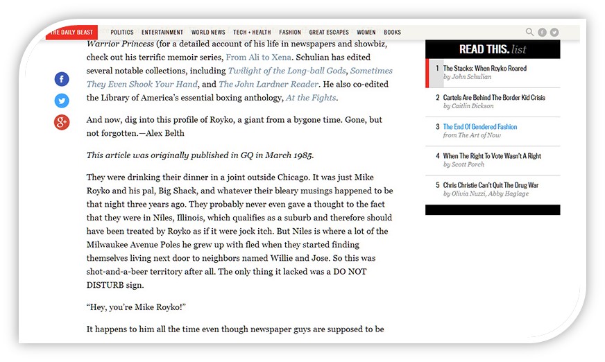
Firstly, the headline stays still, but as your scroll down the article, the text scrolls with you. This is a microinteraction — small product details/features that accomplish one sole task.
Especially on a mobile screen, an extra push to stay focused on an article’s title and headline while flowing through the story’s text is always appreciated. Notice how the Daily Beast lets you do that, you can fish out the important points in the article — instead of spending extra time sifting through the bits that are less relevant to your knowledge base.
Another microinteraction that has a macro effect on the content’s storytelling is the ‘READ THIS’ box on the right. It shows you your progress among the important articles on-site, and highlights the one you’re currently reading.
When you have 17 minutes left on your 32 minute train ride, you can read wisely, and give yourself enough time to skim through each article without losing time to skim through the others.
In essence, it’s a simple vertical menu, but it targets the choices that are most important to the reader, and brings them the results that give them the best version your story.
If your ad demands a response, make the selection process crystal clear and straightforward. Beggars can’t be choosers, and yep, you want them to choose.
Card Design: Oh, so snackable
Another popular choice for mobile-minded web pages, the card layout, placed on a grid of ‘bite-sized chunks’ of content.
As phrased eloquently by econsultancy.com, cards usually include snippits of info (but the ones you need, nonetheless).
They’re like condensed web pages, telling you the facts you need the most: a title, a user name, a picture, and various icons. There may be a brief amount of text, like a product description.
Wired is a great example of a publisher that masters the art of the card design.
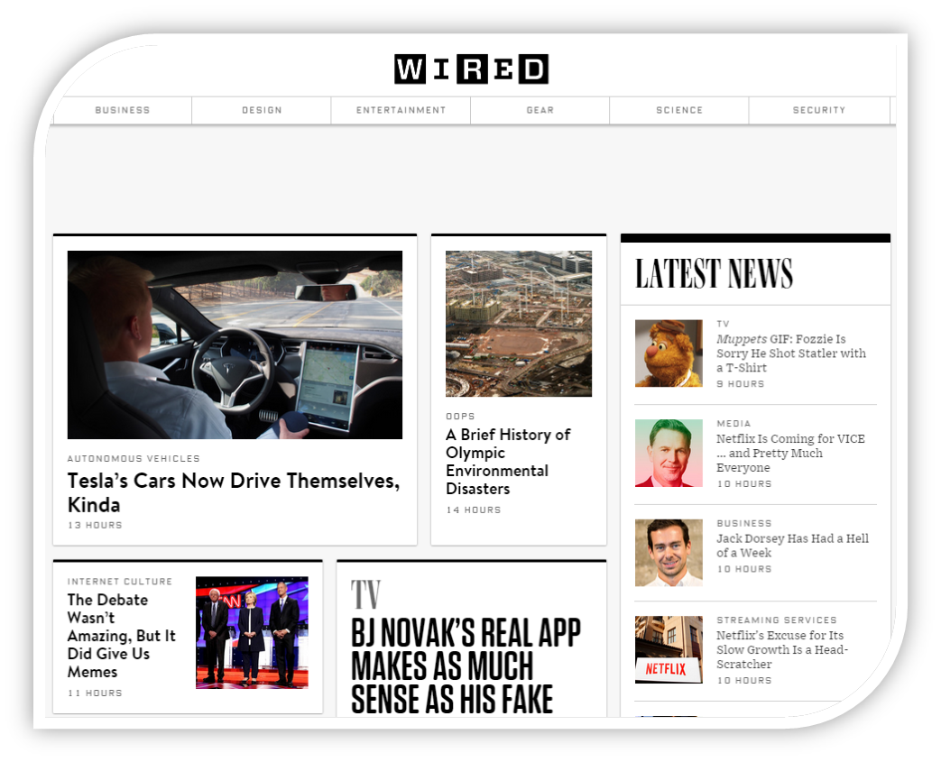
TheNextWeb attributes the essence of the card layout as Pinterest-inspired. The card layout knows that on your mobile, you can really achieve only one action at a time. And it caters to just that. It strives to make that one interaction as accessible as possible, with utmost visual grace. And hey, your Click-Through-Rate can only thank you.
The card layout is a form of container-style layout. It takes one concept and uses a responsive web attitude to map out all your options — that is, your interests within the topic, and your options for which action to choose.
It’s all in one container, but it responds to you directly. And it’s mutual, because you respond in turn.
If you can dramatize your content so that all the info you’re publishing stands its own ground, why stand in the way? Give each bite of content the time to shine. It’ll make publishing so much more fun. Scout’s honor.
Last Glance
It’s pretty clear that there’s no shortage of special effects for publishers who want to grow readers by the dozen. When telling our best stories, it’s no fun unless our readers can live through our experience, too. Every time we invest in designing a web page layout (especially in mobile-view), we must keep in mind all the options out there to make our stories as dramatically real as possible. Think of it as a visual cliffhanger.
Which web design features have been most successful for your publishing? Share your success stories with us below!