If you’re reading this article, you care. You really, really care. You care about your readers and their experience on your site. You want to make it pleasant, to get them to want more, to come back to your site, to stay long enough to let you build a relationship with them.
If you’re reading this article, you understand that the different layers of user experience directly impact your ability to properly monetize your online publication, and you want to see how industry leaders master it in real life.
That’s exactly what we’ve got for you here. After covering the top online sports publishers of 2016, we’re turning to another industry where fans are passionate, but competition is brutal.
You guessed it – we’re talking about the fashion industry.
Here’s what you can learn from the top online fashion publishers.
1) Vogue gets the importance of a visual experience
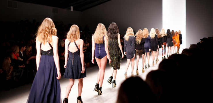
Human beings are visual creatures – 90% of the information that comes to the brain is visual. While that’s true for all industries, it’s especially important in fashion.
Fashion is all about visual self expression. It’s about telling a story through visual aids, such as clothes, shoes, necklaces and handbags. It’s about transforming into who you want to be and who you can be with visuals.
Therefore, the top online fashion publishers put a big emphasis on using images on their websites. But few do it as well as Vogue.
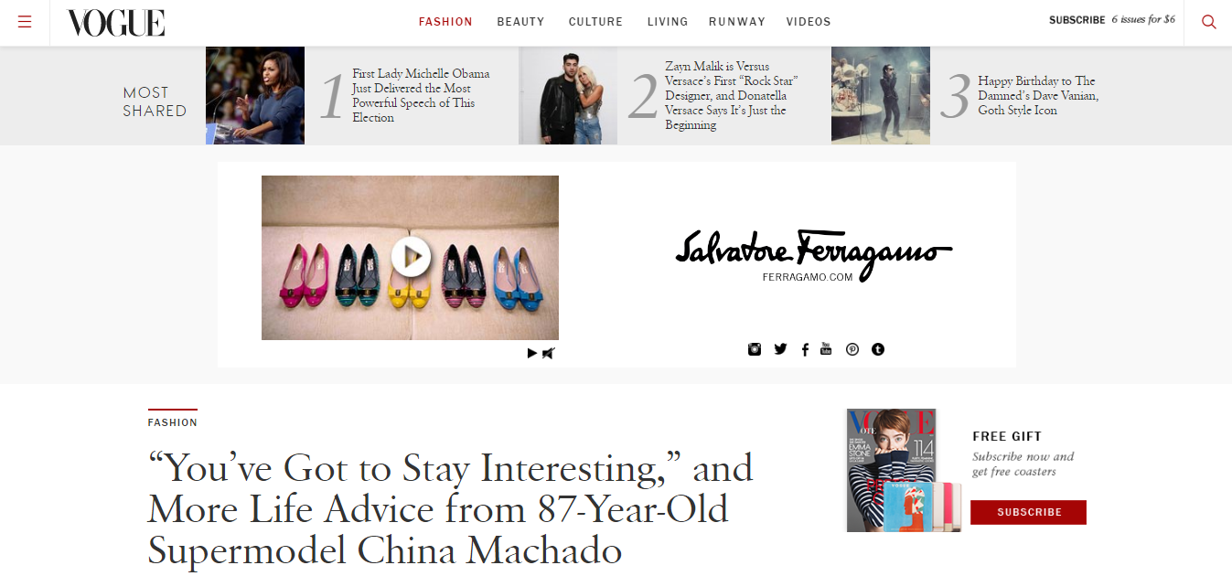
From the moment you log in to Vogue’s home page, you see large images, large fonts, and lots of white space that convey feelings of luxury, freedom and powerful choices.
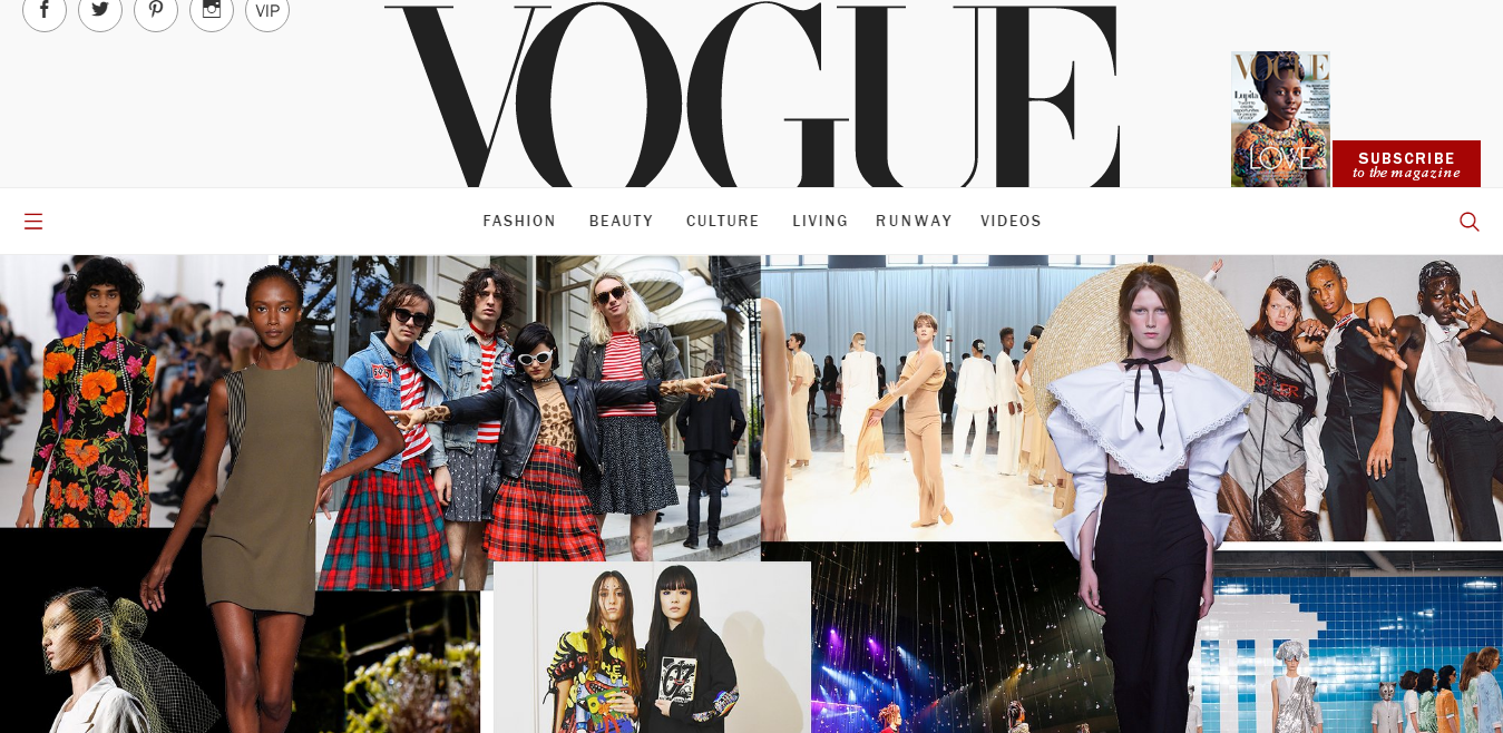
Vogue mixes up the imagery right there on the home page – different image sizes, GIFs, videos. The layout changes throughout the page, too. Sometimes you get a full width video, image or banner ad. Sometimes you get two columns: an article headline and image on the left, with an ad on the right. Other times the right sidebar is filled with nothing but white space to give you some air.
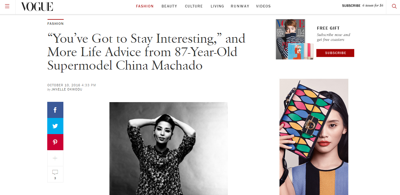
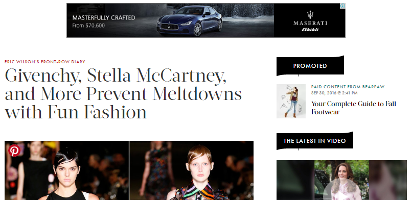
Inside the articles, Vogue takes a risk. When you click through to an article, the article itself is below the fold. The top of the page is filled with content recommendations, ads and the article’s headline. This could have easily annoyed readers if it wasn’t so beautifully designed.
Here’s how it looks above the fold:
And this is what you see when you scroll down:
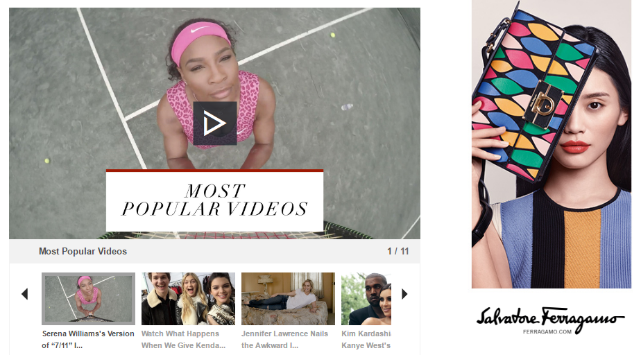
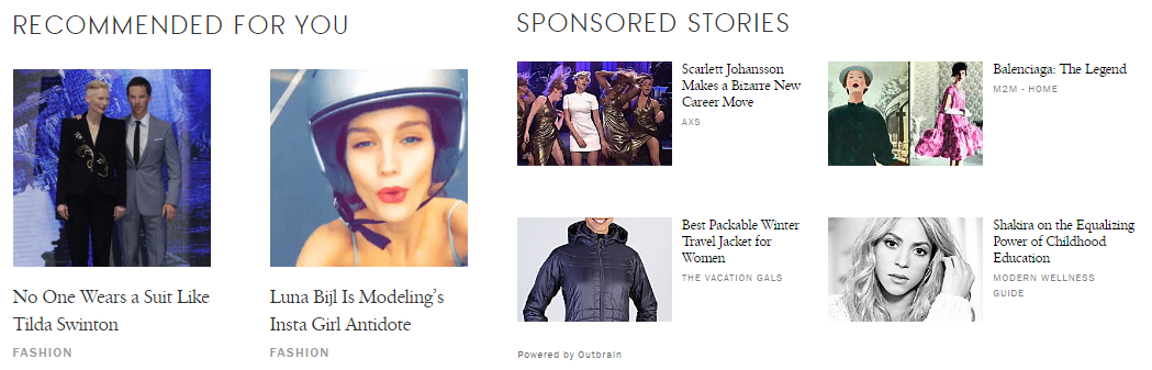
Below the article, you get video recommendations, article recommendations and sponsored posts to browse through – all wrapped up with beautiful imagery.
Want to read the next article in line? Simply scroll down and you’re there. It’s as easy as that.
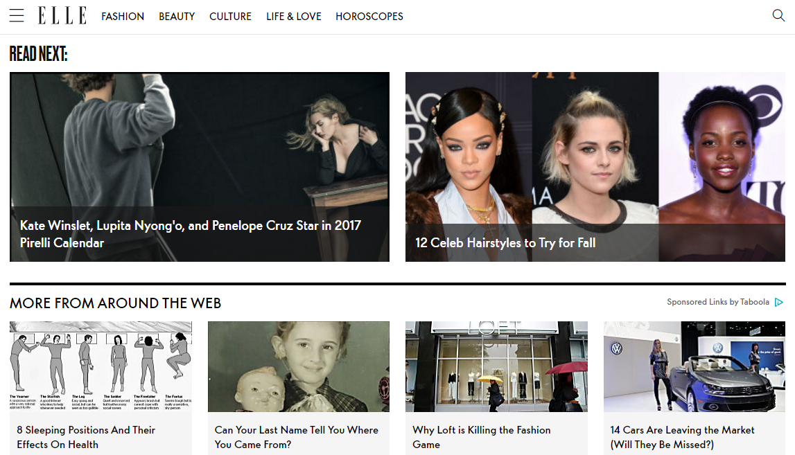
2) InStyle diversifies monetization with content recommendations and banner ads
Content recommendation has been around for a long time. At the end of an article, you offer relevant content pieces that could interest your reader.
The common strategy used to be to offer additional reading materials on your own site, to keep visitors on the site for longer periods of time. On one hand, Google rewards sites that seem to offer so much value that readers don’t bounce. On the other hand, publishers get to build a deeper connection and a bigger presence in their readers’ lives. It’s a win-win.
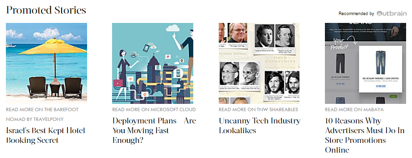
And indeed, many of the top online fashion publishers offer content recommendations from their own sites. But many also take the next step and feature sponsored recommendations.
Natively weaved through the site, these content recommendations appear as just another piece of the site. This smart monetization strategy overcomes the big challenges of banner blindness and reader irritation with ads. When done well, content recommendations are perceived by readers as adding value, so they click through, and publishers earn.
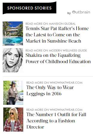
The most common strategy is to place these content recommendations below articles, and InStyle does just that.
But InStyle goes a step further. It places “promoted content” on the right sidebar, where bloggers usually place popular posts as well as banner ads. That means readers are used to seeing content recommendations and ads on the right sidebar. InStyle simply mixes the two.
As you can see, InStyle also mixes up ad networks.
To top it off, it adds banner ads and sponsored content recommendations in article index pages.
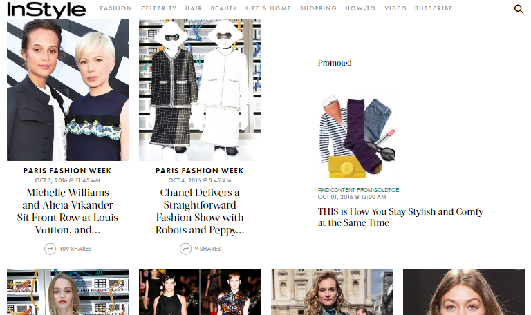
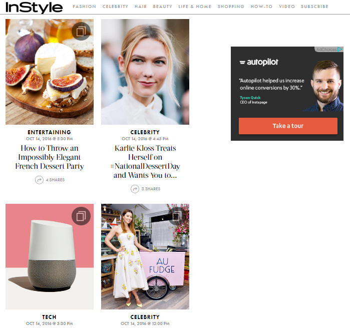
The promoted content stands out: it’s tagged as “promoted” and gets more white space than regular articles. But it’s not intrusive. It blends in with the on-site content recommendations.
3 & 4) W and Seventeen provide accurate offers
For content recommendations to work, it’s not enough to weave them natively into your content. You have to make sure the content is the kind your audience is hungry for. The kind that will help your audience thrive.
W magazine gets it. Its readership has a median age of 40 and a median household income of $90,000. Almost half of its readers earn 6 figures a year. Therefore, its ads are selected to serve a luxury target audience. Among others, W features ads for luxury fashion, couture jewelry and cars.
An important strategy to learn from the top online fashion publishers is to know your audience. Imagine these types of ads in a publication like Seventeen, which targets teenage girls. Sure, some readers will click through out of curiosity, but otherwise, the ads won’t convert well. Most teenage girls just don’t have that kind of budget.
So here are two of the ads we found on Seventeen’s site:
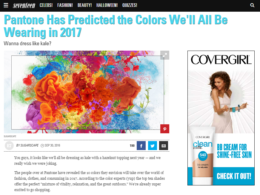
These are the kind of products Seventeen’s target audience can afford. They’re the kind of products that will make that little difference that will help them feel like a star in their everyday lives – whether they’re in a classroom or hanging out with friends.
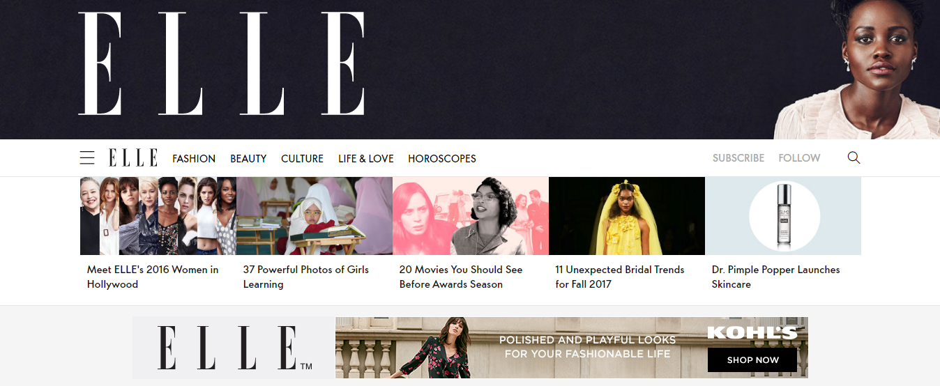
5) Elle creates a great user experience
All the strategies we covered above are critical for any company that wants to be one of the top online fashion publishers. That’s because all these strategies combined make one great user experience.
That’s what Elle does.
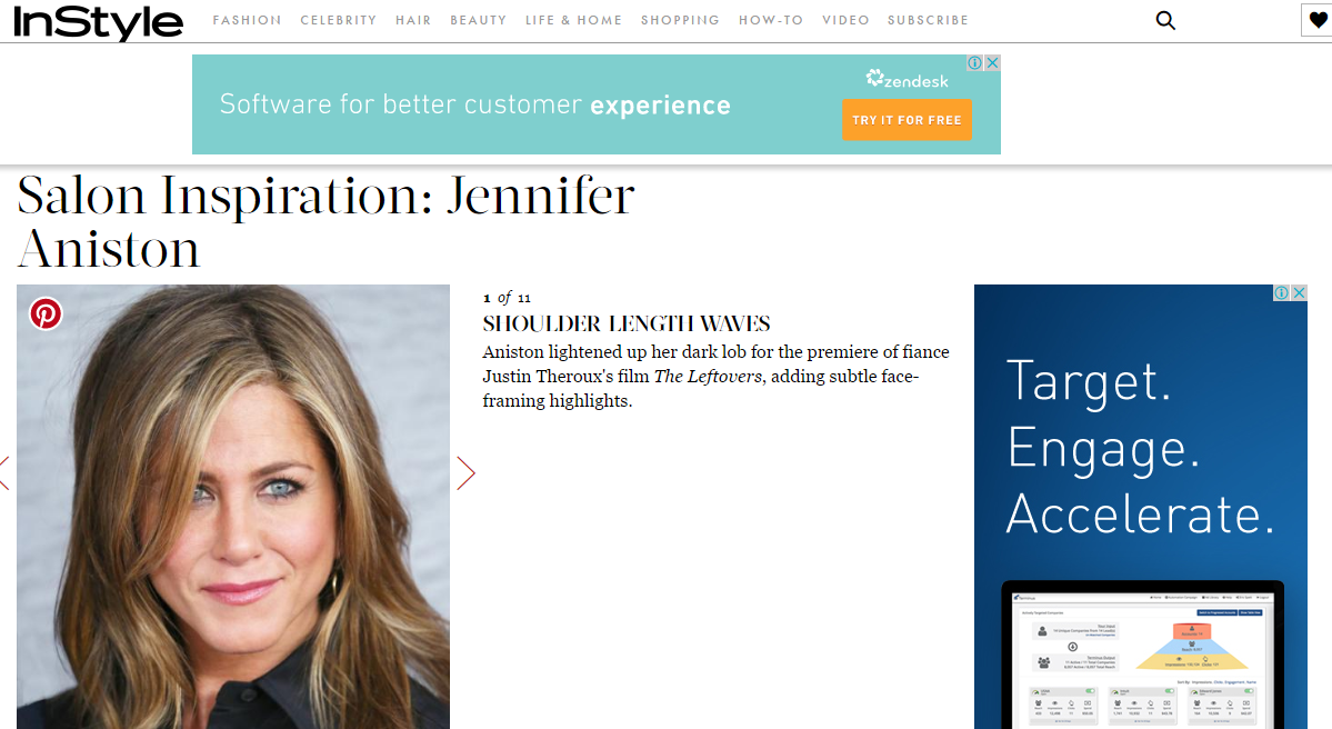
Elle prioritizes the visual experience. It uses a decent font size and large, high quality images.
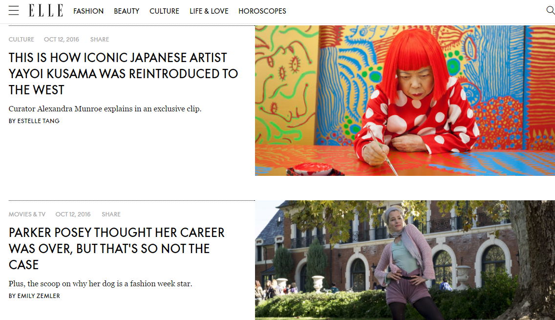
Despite the large images, Elle’s website loads quickly. That remains true even in articles that contain dozens of images, whether in one page or in a slideshow.
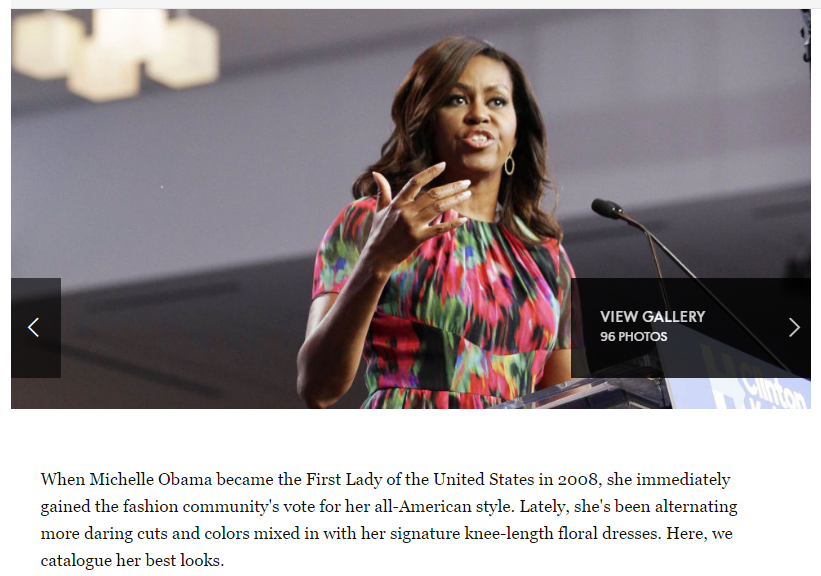
Elle’s content recommendations are non-intrusive, and its ads are spot on.
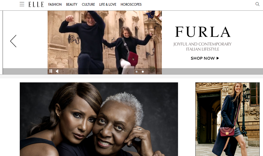
Browsing through Elle is easy and fun, and makes you want to stick around.
Key takeaways from the top online fashion publishers
If you didn’t have the time to read the entire piece, here are the key things you should walk away with:
- Building a great fashion site is all about creating a visual experience. Mix it up with a variety of image sizes, GIFs, and videos.
- Content recommendation can serve two important purposes: decreasing bounce rates and/or effectively monetizing publishers’ sites.
- When it comes to fashion, delivering relevant ads will make all the difference.
- Elements that make a great user experience: Quick loading times, easy navigation, engaging ads, and the right use of images.
Very interesting