 Top online news publishers work hard. They must be the first to report stories, or their competitors will get enough impressions to leave them behind. And there are a lot of stories to uncover and share. They must provide an interesting angle, some great interpretation – and that’s not even enough.
They must package everything with beautiful images, and distribute the content on time.
Tomorrow, they’ll have to start everything from scratch. The content they worked so hard to create and deliver today will be old news by then.
How do they stand out of the crowd?
Top online news publishers develop site engagement
As Andrew Raso, co-founder and director of Online Marketing Gurus, pointed out on Content Marketing Institute early in 2016, the popular focus on how many people see your content is “a vanity metric. It means little. It’s also easily manipulated,” as in the case of clickbait headlines.
That’s why what really matters to marketers who want results is audience engagement. “Engaging content makes the person stop everything to spend time and energy reading and taking in your message,” David MacLaren, CEO and founder of MediaValet, told Content Marketing Institute later in the year.
For online publishers, that means site visitors who spend more time on each article you publish, and click around to consume more content, thus reducing your bounce rate to Google’s satisfaction.
It’s readers who are passionate enough about your brand, that they take time to leave a comment and participate in discussions with other readers. It’s these readers who will end up sharing your content on social media, telling their friends about you, clicking on your sponsored content recommendations, and coming back for more. That’s because they increasingly become emotionally attached to your brand.
In most industries, you can get similar information from multiple publishers, and that’s especially true in the news industry. One way Fox News differentiates itself is by creating an active comment section.
Check out this article about a man that’s being deported after he was adopted by an American couple, for example.

372 people are following the conversion in the comment section…
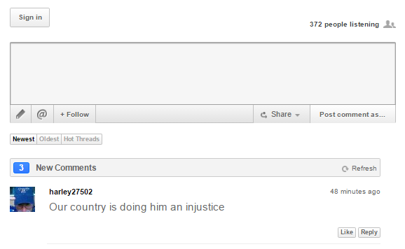
…and readers are either leaving long comments or participating in discussions with others.


Notice how Fox lets you like other readers’ comments?
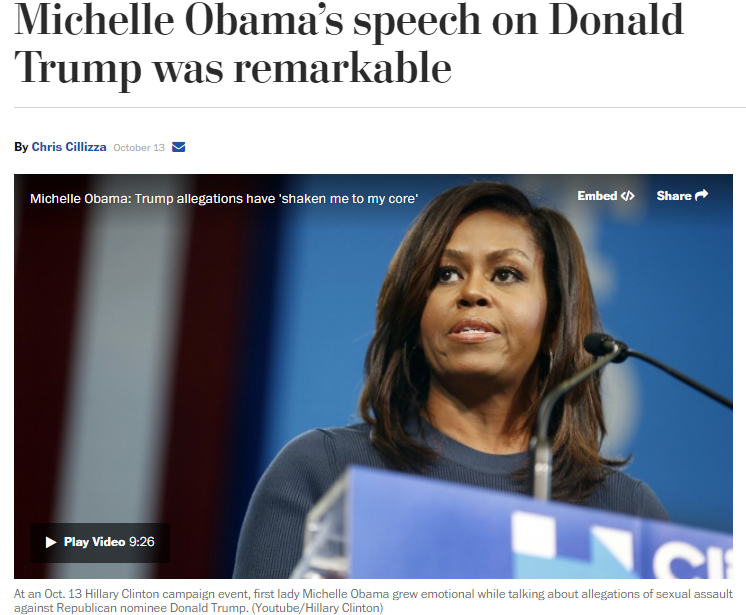
The Washington Post does that too, and its engagement is through the roof. This article about Michelle Obama’s recent speech received 2,100 comments.
Another Washington Post article – on legal discrimination – received only 218 comments, but discussions in the comments section debated multiple topics related to the article: whether a fetus has rights, the economic situation of women vs. men, and ethnicity’s impact on one’s earning potential.

When engagement is this high, online publishers get an extra benefit – user generated content, which becomes just as important as the content the publication produces.
The best online news publishers build a great mobile site
According to Smart Insights, 91% of Internet users own a computer and 80% own a smartphone. 67-82%, depending on the age group, use the internet across multiple platforms. 7-20% (again, depending on the age group) don’t use desktop at all. That means that up to a fifth of your audience uses only mobile devices in its Internet adventures.
If your site isn’t mobile friendly, your competitors’ sites are a click away.
The New York Times understands it, and has stepped up to the plate, with large images and large fonts, that make it easy and fun to use its mobile site.
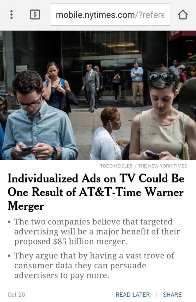

Interestingly enough, the font size is easier to read on the New York Times’ mobile app than on its website. In other words, The New York Times has read the Internet usage map and it’s prioritizing the mobile experience a growing number of people need.
And it’s not the only one. The Los Angeles Times’ pages load much faster on mobile than they do on desktop.
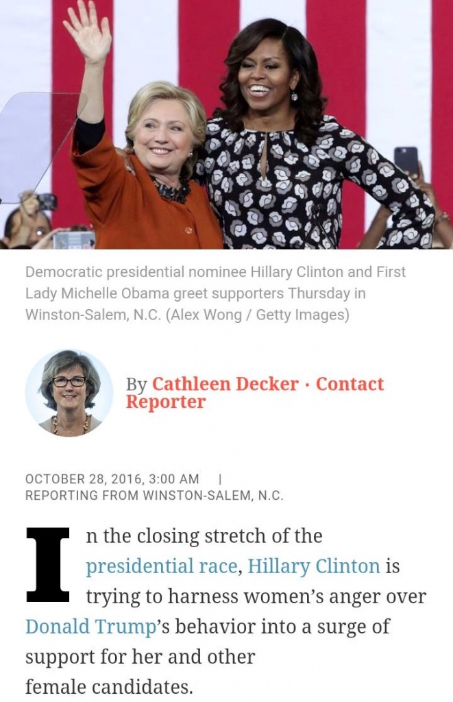
Like the New York Times and the Los Angeles Times, CNN cares about readers’ mobile experience. It provides large fonts, beautiful images, quick page load times, and doesn’t add distractions like non-ending pop ups.

The content recommendations include large enough images as well, that they’re easily clickable:
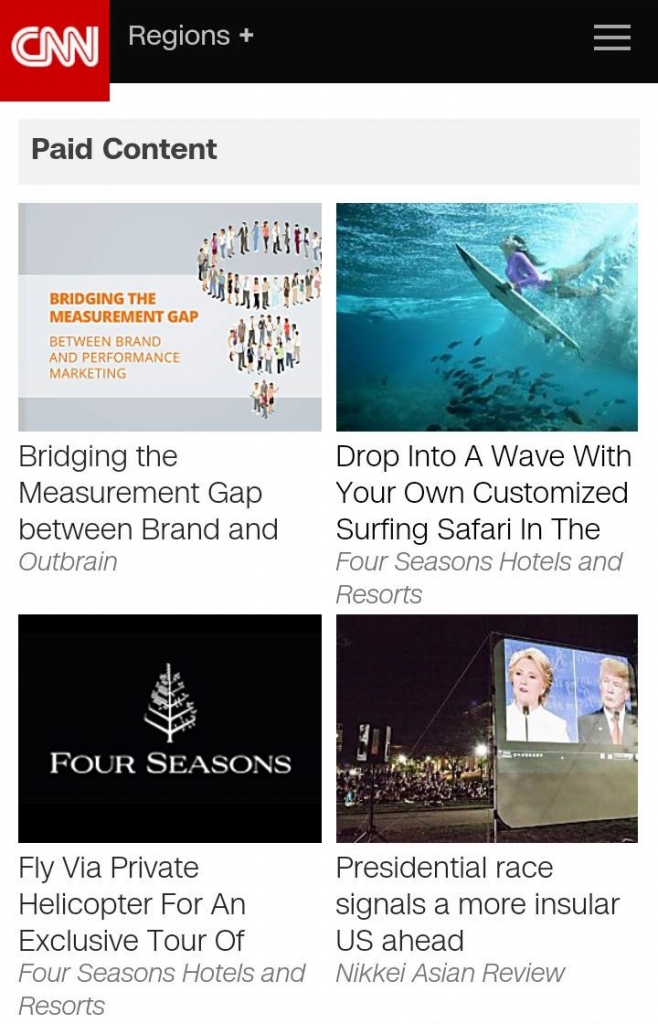
After all, already back in 2013, 44% of CNN’s traffic in the United States came from mobile, according to the American Journalism Review.
In an interview with the American Journalism Review, CNN’s mobile editor, Etan Horowitz, pointed out that site visitors consume different types of content on a TV, computer and mobile. “Even among mobile, the way someone uses a phone is different from the way they use an iPad,” he said.
First, Horowitz saw a difference in peak times. He said the desktop site gets most views “between noon and about 2 PM ET.” However, mobile views peak “between 8 PM ET and 11 PM ET.”
Second, people actively turn on the TV channel or log in to a website on their computer as they sit down and relax. On the other end, if they download a publisher’s mobile app, they often get notifications about new stories. In other words, “the news comes to you” while you’re on the go, doing something else, Horowitz told AJR.
Top online news publishers serve ads readers actually want to see
Top news publishers want to keep readers around, engaged and happy with their experience on the site. Therefore, they know that their ads must be relevant to their target audience and its needs. But there’s one little problem: many Internet users don’t like ads.
Many people view ads as interruptions. They want to log into a site and consume content that interests them. They don’t want to feel they’re on the defense because someone is constantly trying to sell them something.
But that’s exactly how many people feel – and they’re doing something about it.
According to The Next Web, around 200 million people “use ad blocking tools, which will cost publishers over $21.8 billion in lost revenue.”
But that’s not all.
If you’re a publisher, it doesn’t really matter if your readers use ad blocking tools. Chances are many of your readers don’t see your banner ads either way. In a very common phenomenon called banner blindness, readers’ minds act as natural ad blocking tools.
Internet users have seen banner ads placed in the same spots over and over again around the web. They’re so used to it, their brains now ignore these ads to make content consumption processes faster and easier.
Therefore, smart publishers have changed directions and gone native.
Native ads mean content that looks like every other piece of content on your site, but someone actually paid you to place it there. Alternatively, you offer content recommendations like ABC News does here, and gain revenue for every time someone clicks.

Like ABC News, NBC News features content recommendations at the bottom of articles. Readers are used to seeing in-site content recommendations there, so sponsored suggestions feel like a continuation of that habit.
Unlike ABC News, NBC News mixes visual native ads with text links. NBC goes even further by mixing in non-sponsored content recommendations from their own site. That signifies to readers that the sponsored content shouldn’t be viewed as sales pitches. It should be viewed as another piece of entertaining or useful content piece, just like what they just read.

In addition, NBC News places native ads in another spot that’s often used for in-site recommendations – its right sidebar.

As you can see, top online news publishers are honest with their readers. They disclose paid content as ads.
Another benefit to native ads is that readers are served content, not sales pitches – if you do it right. Readers are much more willing to let their defenses down for great content.
TopRank Marketing reported that “74% of publishers believe that native advertising actually adds value for their readers and viewers.” However, it also reported that 16% of publishers have received complaints about native ads.
The solution TopRank Marketing suggested? First, make sure your native ads aren’t salesy. Second, keep the same high standards for native ads as you do for editorial content.
Top online news publishers leverage the power of visuals
“90% of all information that comes to the brain is visual”, and “the human brain processes visual information 60,000 times faster than text,” according to a Gryffin infographic (as reported by Adweek).
According to Inc, “an estimated 79% of Internet traffic will be video content by 2018.” Inc also reported that “posts that include images [already] produce 650% higher engagement than text-only posts.”
That means that publishers who want engaged readers who read and comment on their articles, browse through their websites, shares stories with their friends and followers, click on native ads, and come back for more… need to step up their visual game.
Check out how top online news publishers do it.
Take ABC News, for example.
The first thing you see when you log into its home page is a large image:
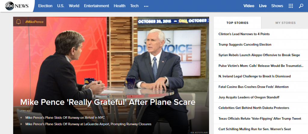
As you scroll down the page, you see more images than text, and can even watch videos.
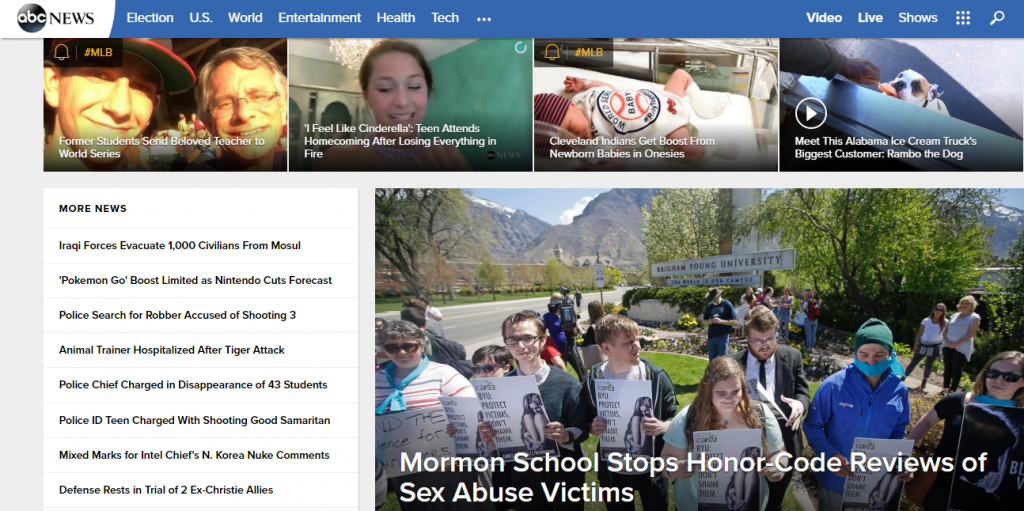
When you log into articles, many of them offer a large image or video right at the top.
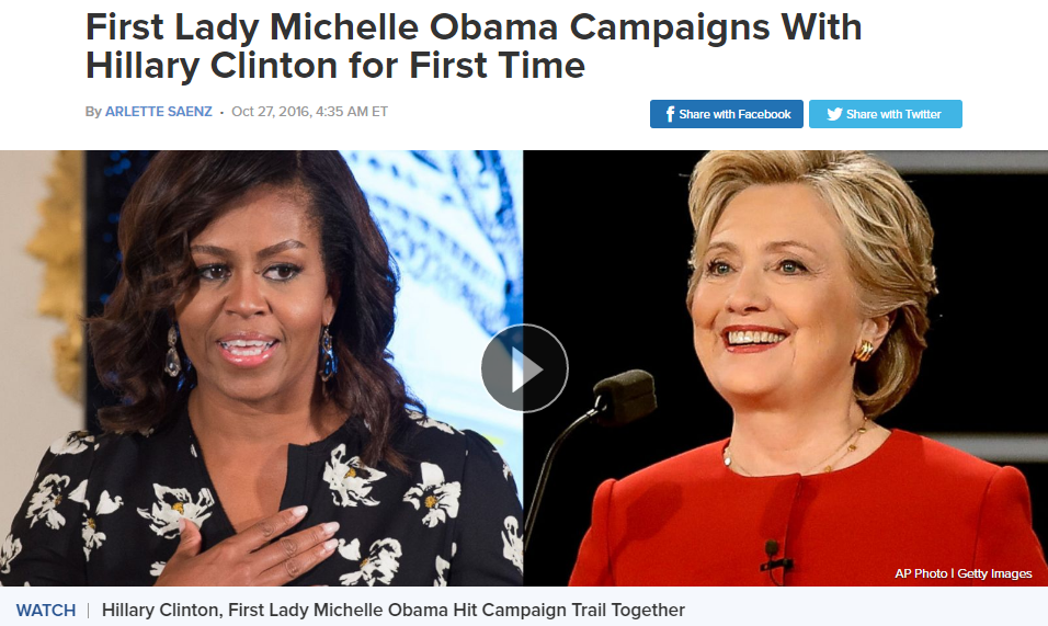
Other articles feature a large photo at the top, and a smaller-sized video – which covers the same topic – on the bottom right corner of the page.

As you can see, the content recommendations on the right sidebar also include images.
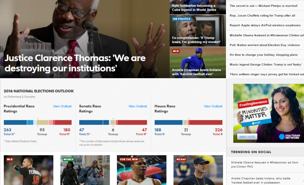
USA Today is another news publication that leverages the power of visuals.
Its home page is filled with visuals.
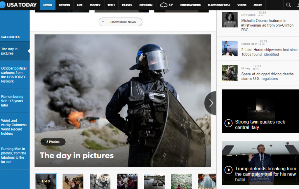
Its section directories are also filled with visuals.
Its articles begin with a large image or video, often right next to a banner ad.
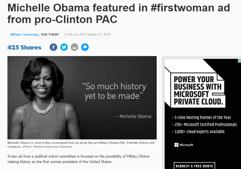
In this article about Hillary Clinton’s intent to spend election night under a glass ceiling, USA Today even embedded a tweet that included a visual:

The top news publishers take visual power to the next monetization level with In-Image advertising
There’s another reason it’s getting critical to prioritize visual content. According to WebDAM, while “verbal intelligence is dropping… visual intelligence is rising.” In an infographic, WebDAM reported that visual IQ is actually “rising faster than any other form of IQ.” In fact, according to the infographic, “the average SAT reading score was at a record low in 2014.”
Therefore, it’s not surprising that people retain and engage with visual information better than we do with just text. That means, as time progresses, ads inside images will work better than ads weaved in text.
According to The Next Web, “images are universally considered integral to the written content they’re published with. To block in-image ads, software would have to block all of a page’s images, which would take away the visual appeal of any website, making it less likely users would turn to ad blocking.”
In-image advertising is a form of native advertising. That means it also successfully battles the banner blindness challenge publishers and advertisers often deal with.
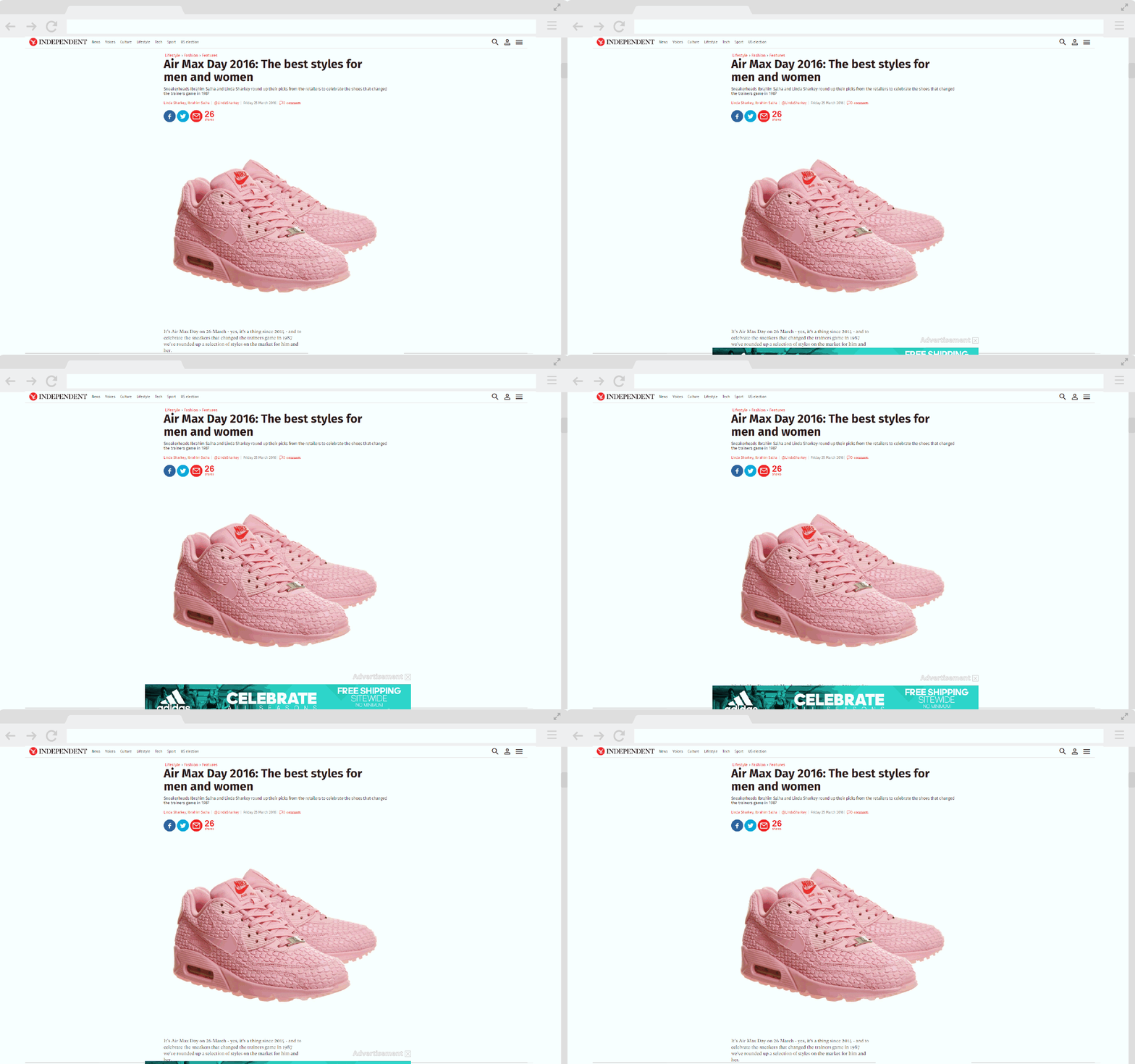
As a publisher, you can also draw attention to the ad by having it slide toward the image. That’s what The Independent does:
The Evening Standard uses the same strategy:
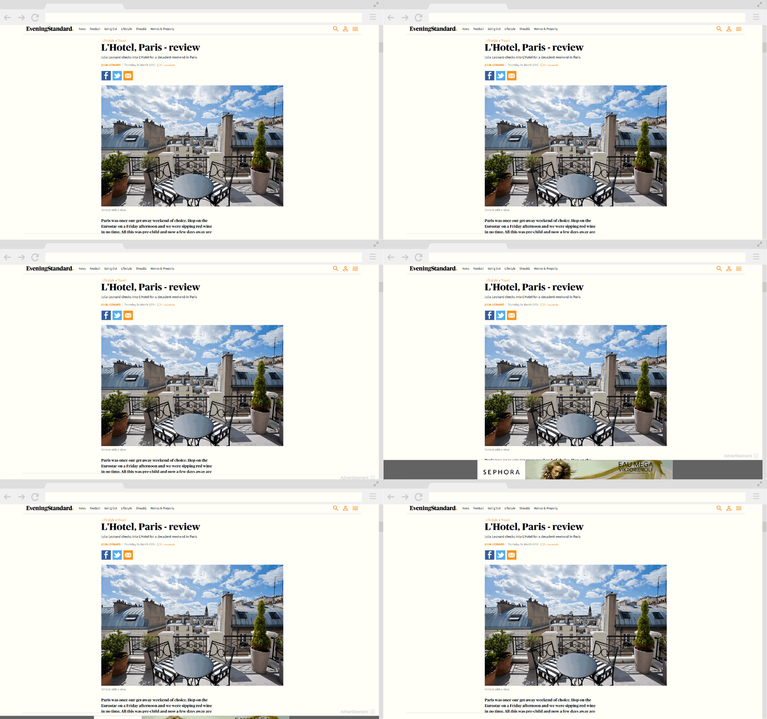
Here’s something important to pay attention to: These in-image ads are relevant. The Independent serves a sports ad in an article about training shoes. The Evening Standard serves a lifestyle ad in an article about travel.
In-image advertising is where the Internet is headed. According to Marketing Land, native advertising as we’ve known it thus far is “the digital advertising industry’s adolescent growth phase as it becomes more comfortable in its own skin.”
But the digital advertising industry is growing up.
And the more it grows up, the more publishers will understand monetization is all about a great user experience.
Top online news publishers deliver an excellent user experience
All the elements we’ve covered here today add up to an excellent user experience. Top online publishers engage their audience, provide lots of visual content, and a fantastic mobile experience. They serve ads that readers actually want to consume, and the best link ads to visitors’ favorite content – images.
It’s the kind of experience that readers want to have again, so they keep coming back for more.


0 Comments